Applied Browser Projects
Responsive Metric Cards
HTML structure, CSS grid, and browser-sized visual frames show metric cards moving from one column to a dashboard row.
Program
A replay lesson can show declarative layout changing across keyframes: the same source creates different rendered arrangements as CSS rules apply.
responsive_metric_cards.html
Visuals: captured from real browser rendering
<section class="metrics">
  <article><b>Visitors</b><span>1,284</span></article>
  <article><b>Orders</b><span>87</span></article>
  <article><b>Revenue</b><span>$9.4k</span></article>
</section>
<style>
  .metrics { display: grid; gap: 12px; grid-template-columns: repeat(3, 1fr); }
  article { border: 1px solid #cbd5e1; padding: 16px; }
</style>
Create the metrics container.
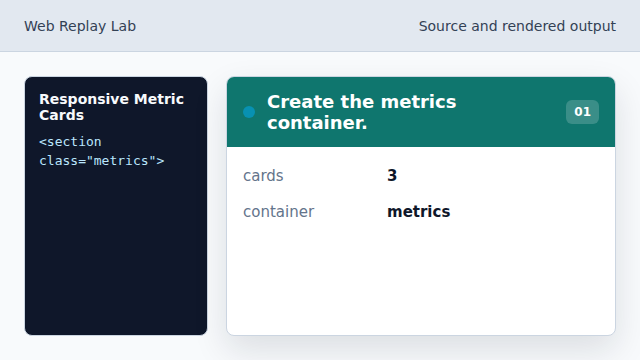
The section groups cards that should flow together. Add a metric card.
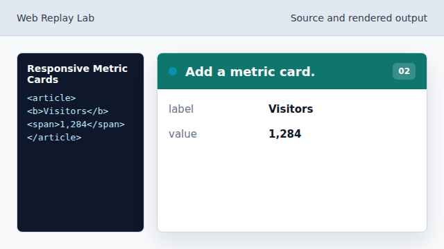
The first card establishes the repeated structure. Turn the section into a grid.
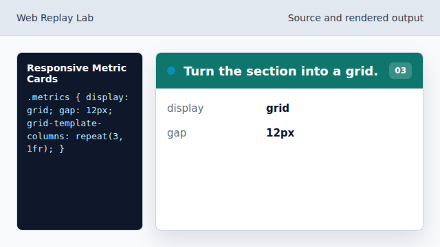
Grid makes the browser distribute cards across columns. Create three equal columns.
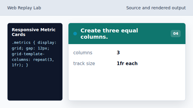
The cards line up in a dashboard row. Frame each card.
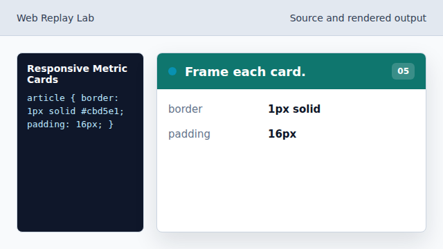
The rendered output reads as separate metric cards.
source and output
The replay pairs the declarative source with rendered browser frames.
responsive layout
Grid columns can express a dashboard row without scripting.