Browser Apis
MatchMedia State
Viewport Data Chooses a Layout
A browser media-query object reports viewport state. The replay shows that reading matches does not repaint until code writes DOM state for CSS to use.
Program
The source reads a media-query result, stores the result in a data attribute, updates visible text, and marks the panel ready.
match_media_state.js
Visuals: captured from real browser rendering
const media = window.matchMedia('(max-width: 700px)');
const panel = document.querySelector('#media-panel');
const label = document.querySelector('#media-label');

const compact = media.matches;

panel.dataset.layout = compact ? 'compact' : 'wide';

label.textContent = compact ? 'compact viewport' : 'wide viewport';

panel.classList.add('ready');
Read whether the viewport matches the compact media query.
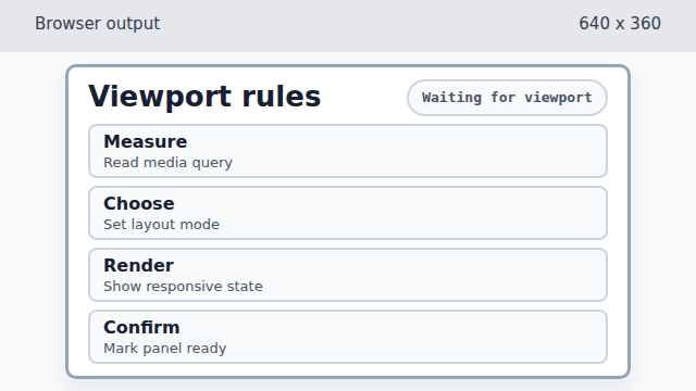
Reading media.matches changes JavaScript data, but the rendered panel is still in the default layout. Store the media-query result as a layout attribute.
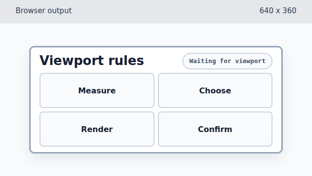
Writing data-layout lets CSS turn the media-query result into a visible compact layout. Show the selected viewport state in the label.
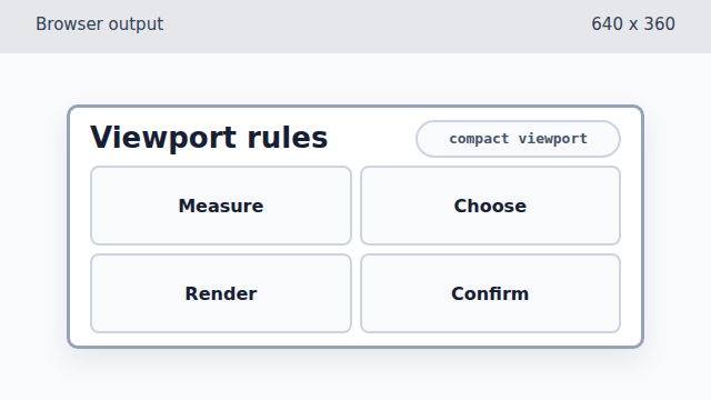
The text update makes the browser-derived state visible to the learner. Mark the responsive panel ready.
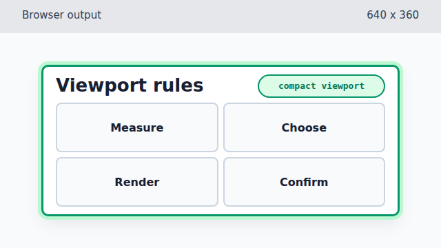
The ready class adds a final highlight after the layout and label already match the media query.
matchMedia
`window.matchMedia(query)` returns an object that can report whether the current viewport matches a CSS media query.
matches
The `matches` boolean is data from the browser. Reading it does not change the page by itself.
responsive state
Responsive state becomes visible when code or CSS maps viewport information to layout, spacing, or labels.