SVG Structure and Transforms
Decorative Icon Button
A button uses visible text for its name while a small SVG arrow is hidden as decoration.
Program
Not every SVG needs its own accessible name. When an icon only decorates nearby text, hide the SVG and let the text name the control.
decorative_icon_button.html
Visuals: captured from real browser rendering
<button type="button">
  <svg aria-hidden="true" focusable="false" viewBox="0 0 24 24" width="24" height="24">
    <path d="M5 12h12" stroke="currentColor" stroke-width="2"/>
    <path d="M13 6l6 6-6 6" fill="none" stroke="currentColor" stroke-width="2"/>
  </svg>
  <span>Next step</span>
</button>
Create the button control.
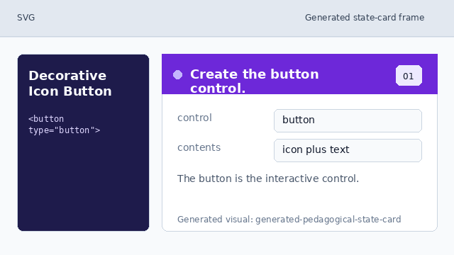
The button is the interactive control. Hide the decorative SVG from announcements.
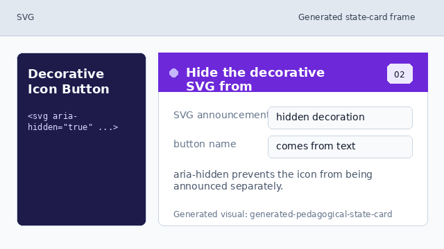
aria-hidden prevents the icon from being announced separately. Keep the SVG out of focus order.
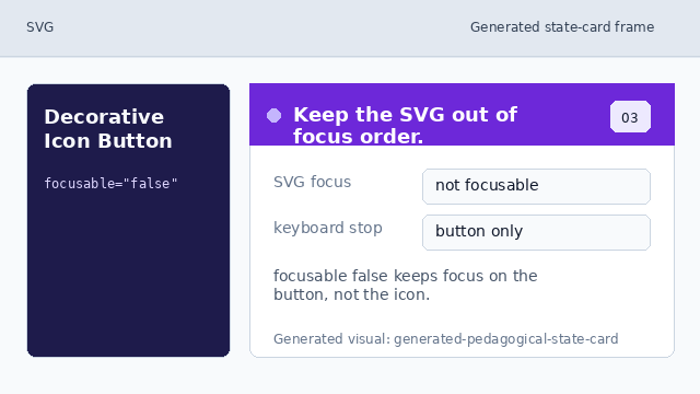
focusable false keeps focus on the button, not the icon. Draw the arrow shape.
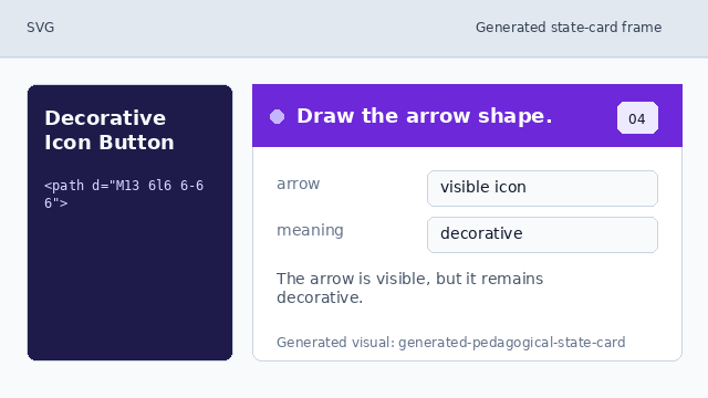
The arrow is visible, but it remains decorative. Name the button with visible text.
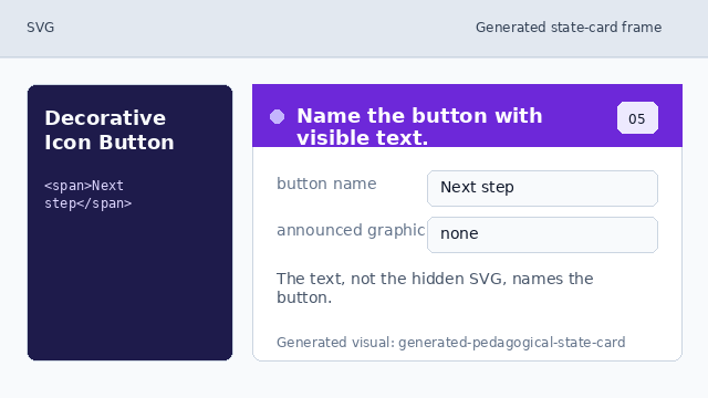
The text, not the hidden SVG, names the button.
decorative SVG
aria-hidden="true" keeps decorative SVG from being announced as a separate graphic.
visible label
The button text gives the control its accessible name.