Motion and Feedback
Transition Button Hover
A button uses transition so hover changes in color and position are animated instead of snapping instantly.
Program
transition tells the browser which property changes should animate, how long they should take, and which timing curve to use.
books/css/09motion_feedback/transition_button_hover/diagrams/transition_timeline.semantic.json.
transition_button_hover.html
Visuals: captured from real browser rendering
<style>
  .button { background: #2563eb; color: white; transform: translateY(0); transition: background-color 180ms ease, transform 180ms ease; }
  .button:hover { background: #0f766e; transform: translateY(-2px); }
</style>
<button class="button">Save changes</button>
Paint the normal button state.
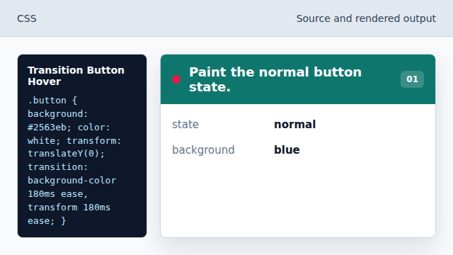
The button starts with a clear primary color. Set the starting transform.
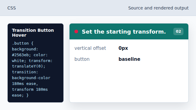
The transform has a known start value before hover. Define animated properties.
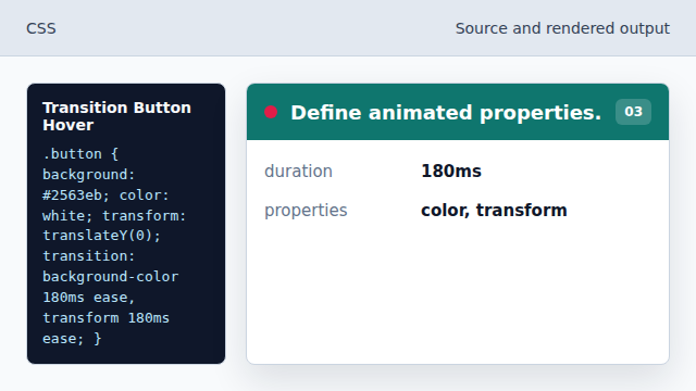
The browser interpolates color and transform changes. Add a hover rule.
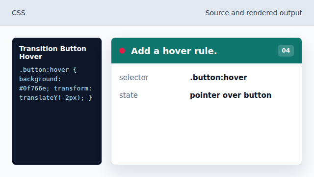
The hover selector provides the target style. Lift the button on hover.
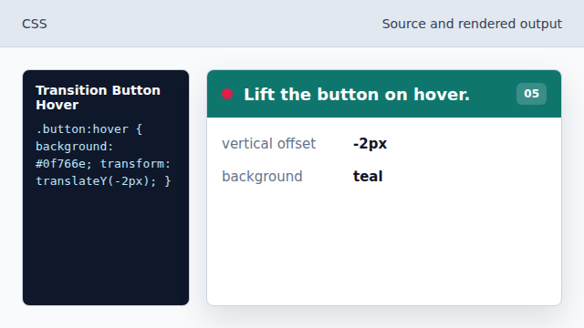
The transition makes the button lift smoothly.
transition
transition animates property changes between old and new values.
hover state
:hover applies while a pointing device is over the element.