Flex and Grid Layout
Page Shell Rows
A small page shell uses CSS Grid rows so the header and footer keep their size while main content takes the leftover space.
Program
Grid rows can make a page frame without JavaScript: header first, main content in the flexible middle, footer last.
page_shell_rows.html
Visuals: captured from real browser rendering
<style>
.page { min-height: 100vh; display: grid; grid-template-rows: auto 1fr auto; }
header, main, footer { padding: 16px; }
main { background: #f8fafc; }
</style>
<div class="page">
  <header>Store status</header>
  <main id="content">Orders are ready to review.</main>
  <footer>Need help?</footer>
</div>
Create the page wrapper.
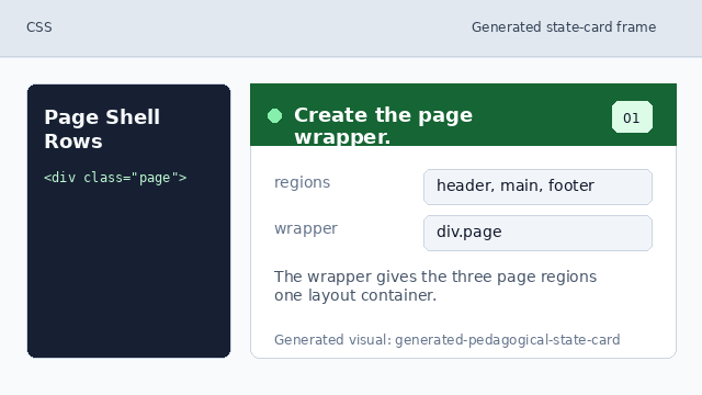
The wrapper gives the three page regions one layout container. Give the shell viewport height.
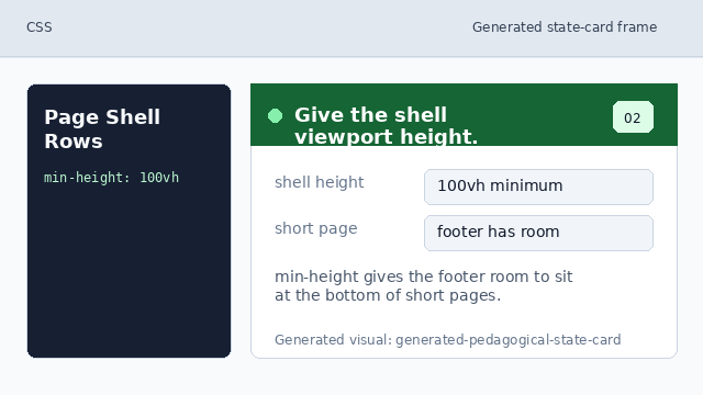
min-height gives the footer room to sit at the bottom of short pages. Turn the shell into a grid.
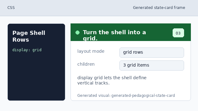
display grid lets the shell define vertical tracks. Define header, main, and footer rows.
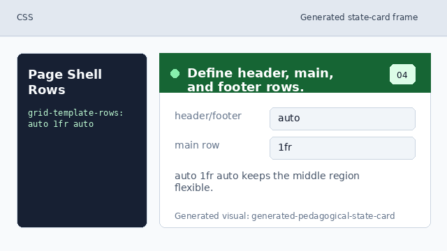
auto 1fr auto keeps the middle region flexible. Place main content in the flexible row.
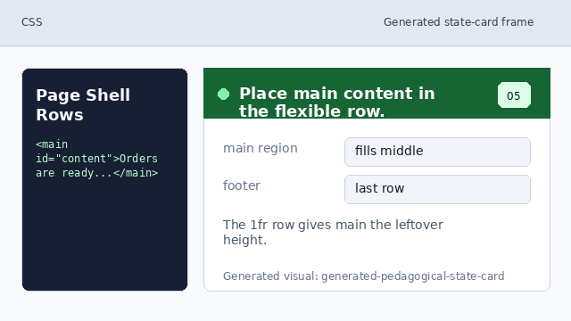
The 1fr row gives main the leftover height.
grid rows
grid-template-rows describes the vertical tracks in a grid container.
flexible middle
1fr gives the main area the remaining height after the header and footer take what they need.