Flex and Grid Layout
Flex Wrap Cards
A row of status cards gains flex wrapping and item basis so cards flow into multiple rows without media queries.
Program
Flex items can wrap when the container is too narrow. A basis gives each item a preferred size before wrapping.
flex_wrap_cards.html
Visuals: captured from real browser rendering
<style>
.cards { display: flex; }
.cards { flex-wrap: wrap; }
.cards article { flex: 0 0 130px; }
.cards article { padding: 16px; background: #dcfce7; border: 2px solid #16a34a; }
</style>

<section class="cards">
  <article>Build</article>
  <article>Test</article>
  <article>Review</article>
  <article>Ship</article>
</section>
Create a flex row for cards.
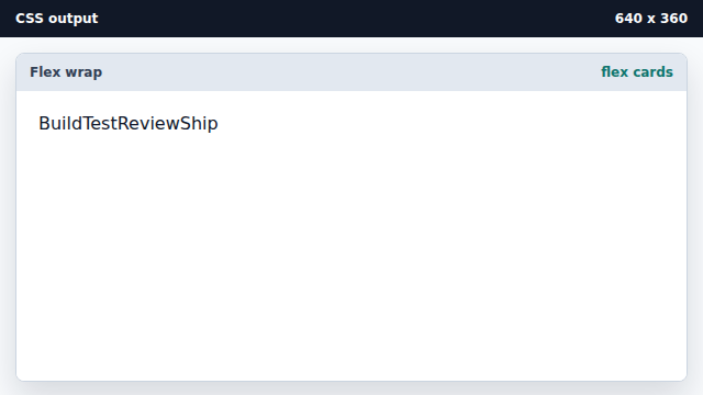
Flex changes the children from stacked blocks into flex items. Allow items to wrap to new lines.
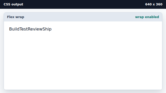
Wrapping is what lets flex handle narrow containers. Give each card a fixed flex basis.
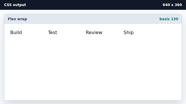
The flex shorthand sets grow, shrink, and basis. Style each flex item as a card.
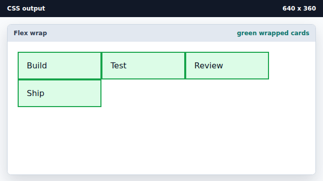
Child styling makes the layout behavior visible.
flex-wrap
Flex wrapping lets items continue on a new line.
flex-basis
The basis is an item preferred size before free space is distributed.