Flex and Grid Layout
Flex Alignment
Three action chips move from normal document flow into a centered flex row with controlled alignment.
Program
Flexbox lays children along one axis. Justify-content works along the main axis; align-items works across it.
books/css/03flex_grid_layout/flex_alignment/diagrams/flex_alignment.semantic.json.
flex_alignment.html
Visuals: captured from real browser rendering
<style>
.toolbar { display: flex; }
.toolbar { gap: 12px; }
.toolbar { justify-content: center; }
.toolbar { align-items: center; min-height: 110px; background: #eef2ff; }
</style>

<nav class="toolbar">
  <button>Back</button>
  <button>Preview</button>
  <button>Publish</button>
</nav>
Turn the toolbar into a flex container.
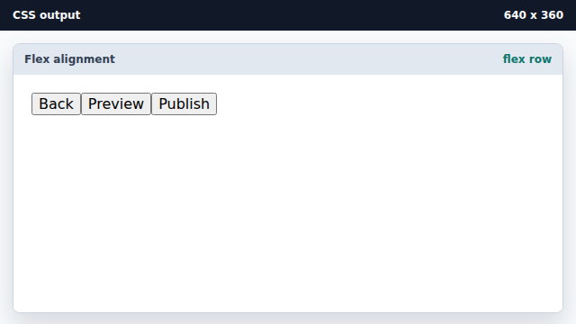
Flex items share a single row by default. Add equal space between flex items.
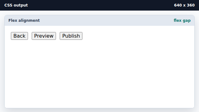
Gap is simpler than adding margins to each button. Center items on the main axis.
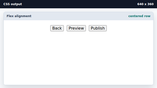
Justify-content distributes free space along the flex direction. Center items across the cross axis.
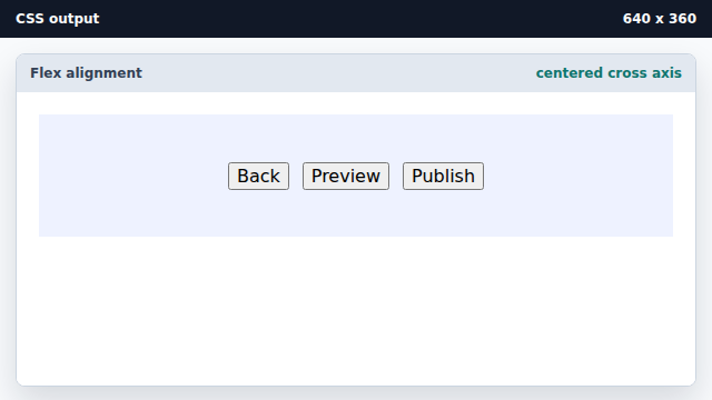
Align-items controls the cross-axis placement.
main axis
The main axis follows the flex-direction.
cross axis
The cross axis runs perpendicular to the main axis.