Responsive Styles and States
Custom Properties Theme
A summary card uses CSS custom properties for accent, surface, and text colors before a theme class changes all of them together.
Program
CSS custom properties store reusable values in the cascade. Changing the value changes every declaration that reads it with var().
custom_properties_theme.html
Visuals: captured from real browser rendering
<style>
.theme { --surface: #f8fafc; --text: #0f172a; --accent: #0f766e; }
.theme { background: var(--surface); color: var(--text); }
.theme { border-left: 8px solid var(--accent); padding: 18px; }
.dark { --surface: #111827; --text: #f9fafb; --accent: #f59e0b; }
</style>

<section class="theme dark">
  <h2>Build Summary</h2>
  <p>42 checks passed.</p>
</section>
Define theme variables on the component.
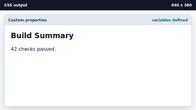
Custom properties are inert until another declaration uses var(). Read surface and text variables.
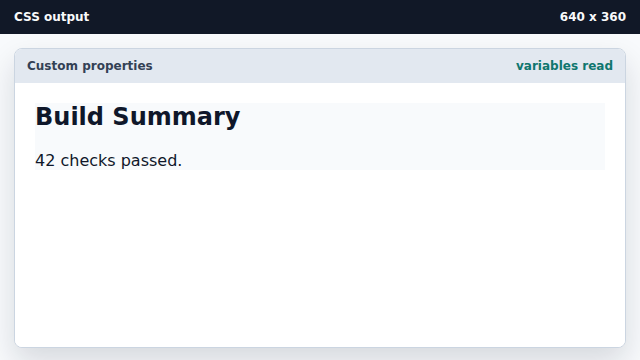
The var() function pulls values from the cascade. Use the accent variable for a marker.
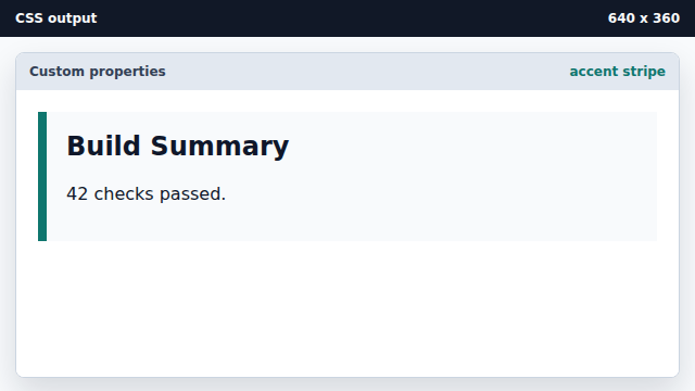
One variable can drive several visual decisions. Override variables with a theme class.
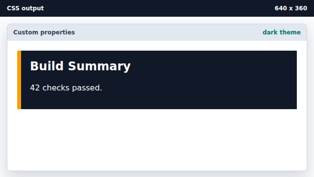
Changing custom property values updates every declaration using them.
custom property
A custom property is a CSS variable such as --accent.
var()
The var() function reads a custom property value.