Filters and Interaction States
Hover Style State
Inline style rules define a default fill for .pad and an alternate fill plus transform for .pad.hover. A second pad with the hover class shows the styled hover state without runtime interaction.
Program
SVG cannot hover during a static capture, but a CSS class can stand in for the hover state. The replay shows the default appearance and the would-be-hover appearance side by side.
hover_style_state.html
Visuals: captured from real browser rendering
<svg class="demo-svg" viewBox="0 0 360 220" role="img" aria-label="Hover style state">
  <style>
    .pad { fill: #a5b4fc; }
    .pad.hover { fill: #4338ca; transform: translate(0, -10px); }
  </style>
  <rect width="360" height="220" fill="#f8fafc" />
  <rect class="pad" x="80" y="80" width="80" height="80" rx="10" />
  <rect class="pad hover" x="200" y="80" width="80" height="80" rx="10" />
</svg>
Paint the viewport background.
A background frames the two rectangles that follow. Define default and hover style rules.
A style block inside SVG behaves like a stylesheet for child shapes. Place the default pad on the left.
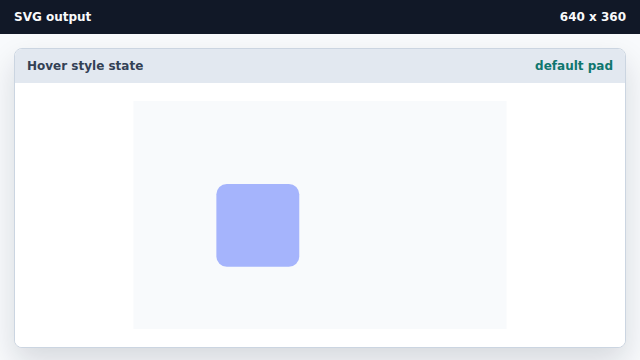
The default .pad class supplies the calm fill color. Place a hover-state pad on the right.
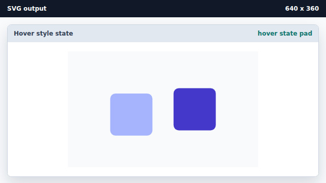
A class proxy lets a static capture show the would-be hover styling.
CSS in SVG
A style block inside SVG applies CSS rules to descendant shapes.
class state proxy
A static class can stand in for an interaction state in an offline capture.