Document Resources
Meta Viewport
Make Layout Match the Device
A small page adds viewport metadata before rendering a responsive lesson card in the body.
Program
Not every important HTML element paints pixels directly. Head metadata can change how the browser interprets the visible body.
meta_viewport.html
Visuals: captured from real browser rendering
<head>
  <meta name="viewport" content="width=device-width, initial-scale=1">
</head>
<body>
  <main class="lesson-card">Responsive lesson card</main>
</body>
Open the document metadata area.
The head holds metadata that can affect rendering before body content appears. Declare viewport metadata.
The name identifies this meta element as viewport configuration. Set width and initial scale.
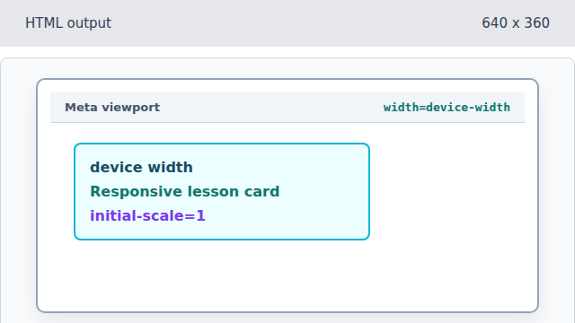
The content value changes layout behavior even though the tag itself is invisible. Render the responsive lesson card.

The body content now uses the viewport metadata already parsed in the head. Complete the visible document body.
Closing the body finalizes the visible content while head metadata stays active.
viewport
The viewport meta tag controls the layout viewport used by mobile browsers.
initial scale
initial-scale=1 asks the browser to start at a normal zoom level.