Responsive Layout Patterns
Wrapping Action Bar
A compact action bar uses flex-wrap and gap so buttons wrap cleanly instead of squeezing together.
Program
Action bars often run out of horizontal space. Flex wrapping lets each control keep a usable size while the row becomes more than one line.
wrapping_action_bar.html
Visuals: captured from real browser rendering
<div class="action-bar" aria-label="Message actions">
  <button>Archive</button>
  <button>Reply</button>
  <button>Forward</button>
  <button>More</button>
</div>
<style>
  .action-bar { display: flex; flex-wrap: wrap; gap: 8px; max-width: 14rem; }
  .action-bar button { min-width: 6rem; }
</style>
Name the action group.
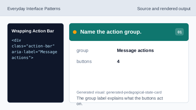
The group label explains what the buttons act on. Use a flex action row.
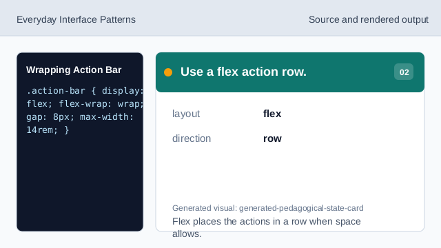
Flex places the actions in a row when space allows. Keep space between buttons.
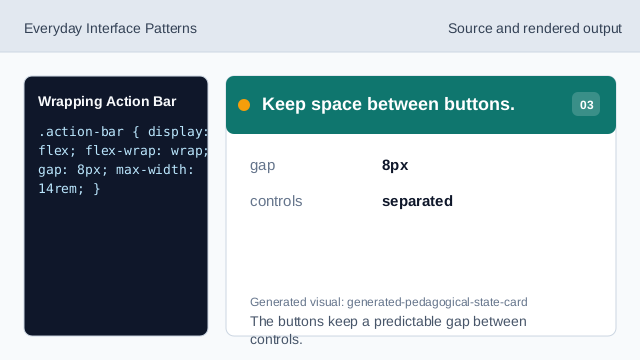
The buttons keep a predictable gap between controls. Constrain the action bar width.
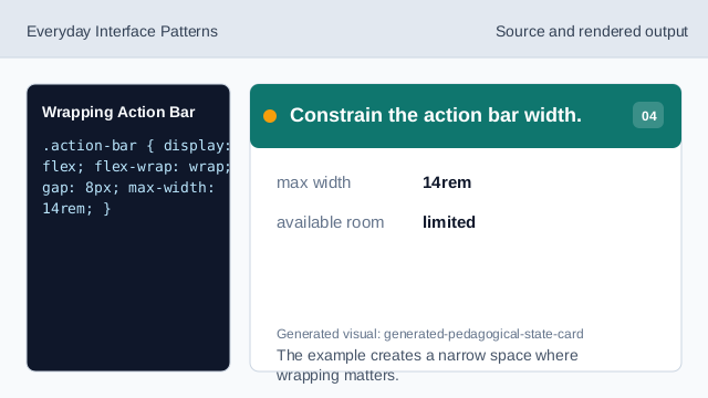
The example creates a narrow space where wrapping matters. Allow controls to wrap.
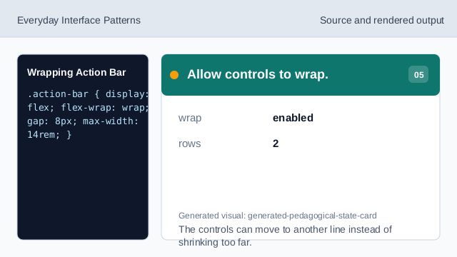
The controls can move to another line instead of shrinking too far. Check each button width.
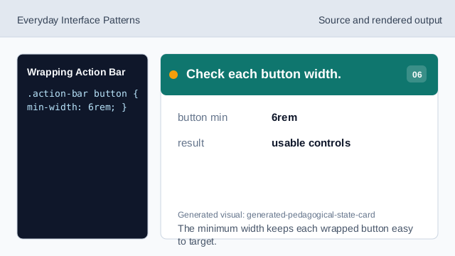
The minimum width keeps each wrapped button easy to target.
action group
A label gives the related buttons a shared purpose.
flex wrap
flex-wrap lets controls move to another line when space is tight.
minimum width
A minimum button width keeps controls usable after wrapping.