Responsive Layout Patterns
Scrollable Table Region
A table sits inside a labeled overflow region so narrow screens can scroll horizontally without hiding the caption or status text.
Program
Wide tables can stay readable on small screens when only the table wrapper scrolls. The caption and status text remain visible around it.
scrollable_table_region.html
Visuals: captured from real browser rendering
<section aria-labelledby="table-title">
  <h2 id="table-title">Monthly totals</h2>
  <p id="table-status" role="status">Scroll sideways to compare all columns.</p>
  <div class="table-scroll" tabindex="0" aria-describedby="table-status">
    <table>
      <caption>Three month totals</caption>
      <thead><tr><th>Month</th><th>Visits</th><th>Signups</th><th>Revenue</th></tr></thead>
      <tbody><tr><th>Jan</th><td>210</td><td>24</td><td>$480</td></tr></tbody>
    </table>
  </div>
</section>
<style>
  .table-scroll { overflow-x: auto; max-width: 18rem; border: 1px solid #94a3b8; }
  table { min-width: 34rem; border-collapse: collapse; }
  caption { text-align: left; font-weight: 700; }
</style>
Name the table section.
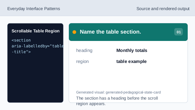
The section has a heading before the scroll region appears. Add a table caption.
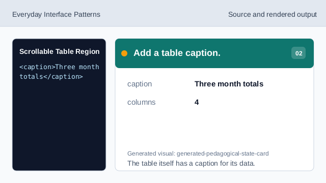
The table itself has a caption for its data. Describe the scroll wrapper.
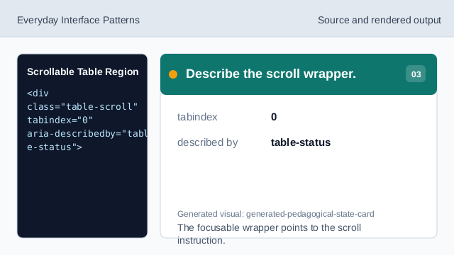
The focusable wrapper points to the scroll instruction. Allow horizontal scrolling.
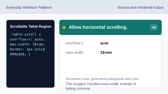
The wrapper handles extra width instead of hiding columns. Keep the table wide enough.
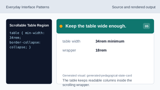
The table keeps readable columns inside the scrolling wrapper. Keep the status outside scrolling.
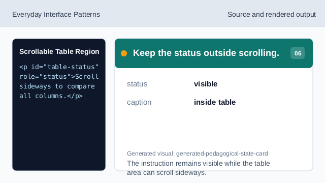
The instruction remains visible while the table area can scroll sideways.
table caption
A caption gives the table a readable title.
scroll region
The wrapper scrolls horizontally while surrounding text stays visible.
status cue
A short status line tells learners what to do on small screens.