Responsive Layout Patterns
Stack to Columns
A small card list starts stacked, then a media query turns the same cards into two columns.
Program
Responsive layout can start with the narrow layout first. A media query adds columns only when there is enough room.
stack_to_columns.html
Visuals: captured from real browser rendering
<section class="card-list" aria-label="Plan cards">
  <article class="plan-card"><h2>Starter</h2><p>Good for one project.</p></article>
  <article class="plan-card"><h2>Team</h2><p>Good for shared work.</p></article>
</section>
<style>
  .card-list { display: grid; gap: 12px; }
  .plan-card { border: 1px solid #94a3b8; padding: 12px; }
  @media (min-width: 38rem) {
    .card-list { grid-template-columns: repeat(2, minmax(0, 1fr)); }
  }
</style>
Name the card list.
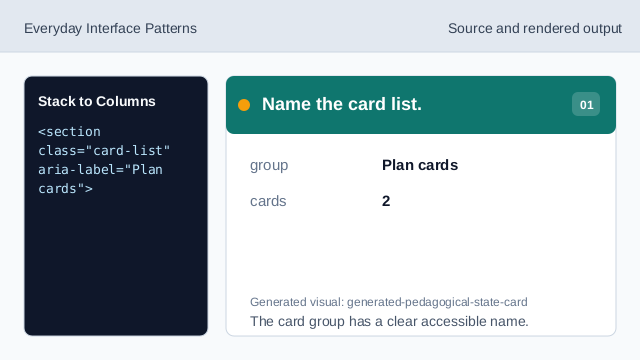
The card group has a clear accessible name. Start with a stacked grid.
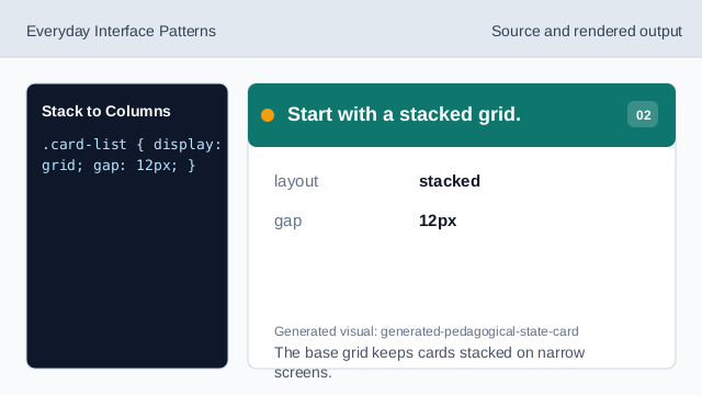
The base grid keeps cards stacked on narrow screens. Frame each card.
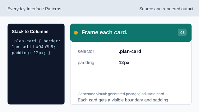
Each card gets a visible boundary and padding. Add the width condition.
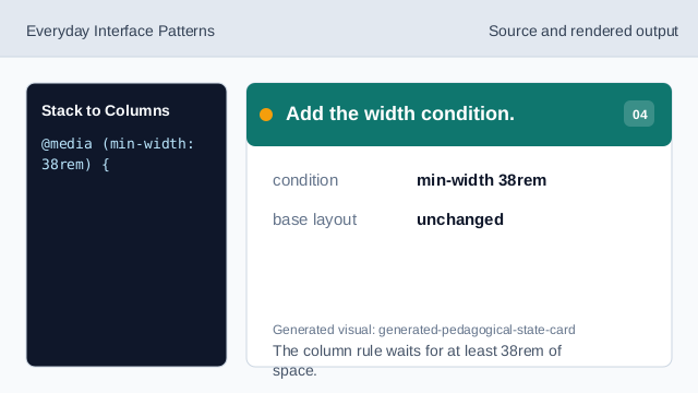
The column rule waits for at least 38rem of space. Render two columns when wide.
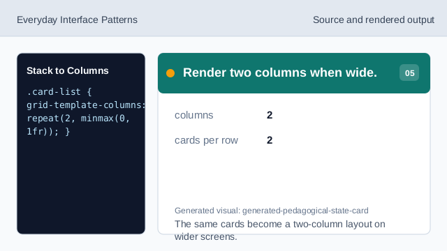
The same cards become a two-column layout on wider screens. Check the column count.
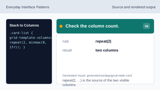
repeat(2, ...) is the source of the two visible columns.
narrow first
The base layout stays stacked before any media query applies.
media query
A media query adds columns when the viewport is wide enough.
card affordance
Borders and spacing make the repeated cards easy to scan.