Motion and Timing Patterns
Transition State Change
A button toggles a panel class so opacity and position change through a CSS transition.
Program
Small motion should be tied to state. This example changes one class, and CSS handles the visual transition from quiet to open.
transition_state_change.html
Visuals: captured from real browser rendering
<button id="details-toggle" aria-controls="motion-panel">Show details</button>
<section id="motion-panel" class="motion-panel">
  <p>Details are ready.</p>
</section>
<style>
  .motion-panel { opacity: .45; transform: translateY(8px); transition: opacity 160ms ease, transform 160ms ease; }
  .motion-panel.is-open { opacity: 1; transform: translateY(0); }
</style>
<script>
  const detailsToggle = document.querySelector("#details-toggle");
  const motionPanel = document.querySelector("#motion-panel");
  detailsToggle.addEventListener("click", () => {
    motionPanel.classList.toggle("is-open");
    const open = motionPanel.classList.contains("is-open");
    detailsToggle.textContent = open ? "Hide details" : "Show details";
  });
</script>
Connect control and panel.
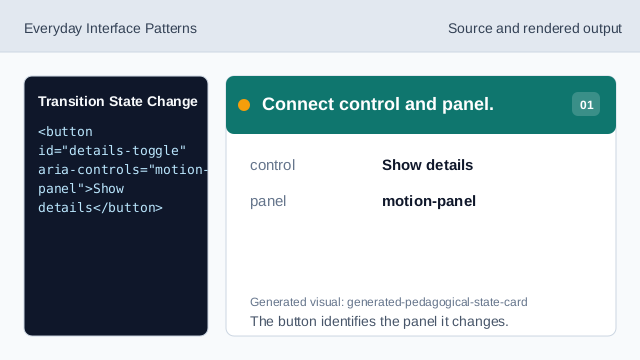
The button identifies the panel it changes. Define the transition rule.
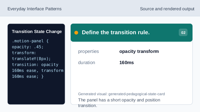
The panel has a short opacity and position transition. Listen for the click.
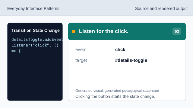
Clicking the button starts the state change. Toggle the open class.
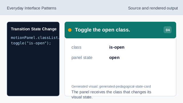
The panel receives the class that changes its visual state. Render the changed state.
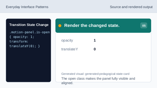
The open class makes the panel fully visible and aligned. Check the button text.
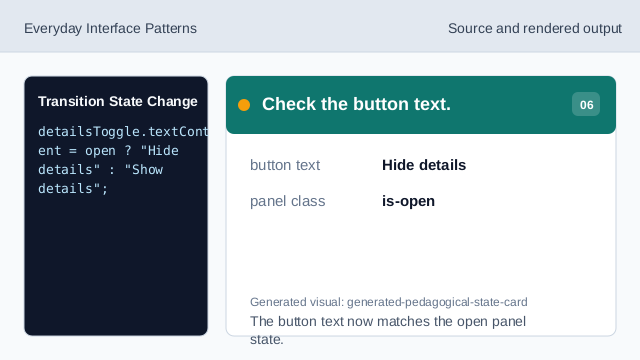
The button text now matches the open panel state.
transition
A transition animates a property change over a short duration.
state class
One class marks whether the panel is in the open visual state.
rendered state
The rendered result comes from the class and CSS rule together.