Popup and Menu Patterns
Focus Help Tooltip
A control uses aria-describedby and a visible help bubble that is available on focus, not hover-only.
Program
Small help text should not depend only on hover. Connect the control to the help bubble and show a clear focus-visible state.
tooltip_focus_help.html
Visuals: captured from real browser rendering
<div class="tip-demo">
  <label for="project-name">Project name</label>
  <input id="project-name" value="Bluebird" aria-describedby="name-tip">
  <p id="name-tip" role="tooltip" class="tip">Use a short name. This help is visible on focus, not hover-only.</p>
</div>
<style>
  .tip-demo { display: grid; gap: 8px; max-width: 28rem; }
  input:focus-visible { outline: 3px solid #0f766e; outline-offset: 2px; }
  .tip { margin: 0; padding: 8px; border: 1px solid #94a3b8; background: #f8fafc; }
</style>
Label the control.
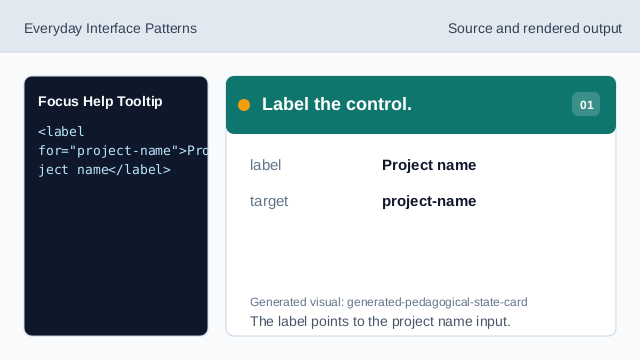
The label points to the project name input. Connect the help bubble.
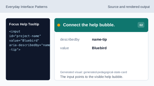
The input points to the visible help bubble. Render the help bubble.
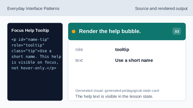
The help text is visible in the lesson state. Add a keyboard focus outline.
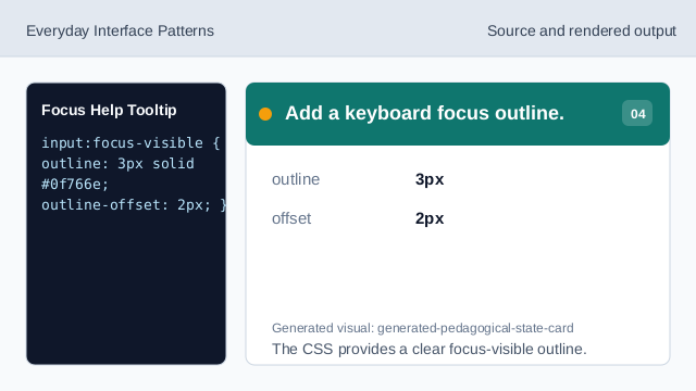
The CSS provides a clear focus-visible outline. Make the help available without hover.
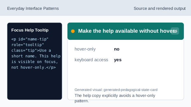
The help copy explicitly avoids a hover-only pattern. Check the focus help pattern.
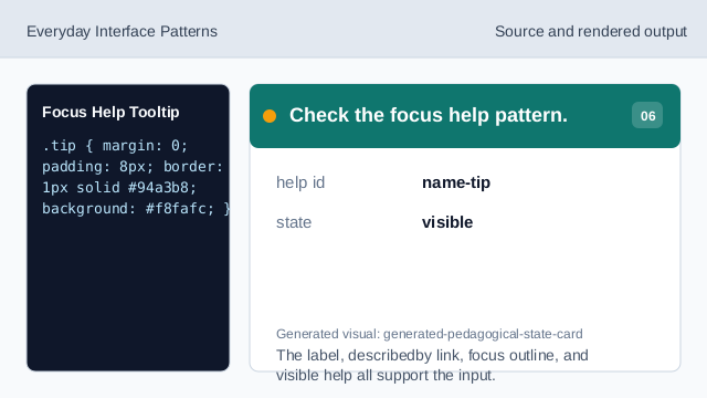
The label, describedby link, focus outline, and visible help all support the input.
described control
aria-describedby connects the input to its help text.
focus-visible
:focus-visible can show a clear keyboard focus outline.
not hover-only
Help that appears for focus is available beyond pointer hover.