Popup and Menu Patterns
Expanded Menu Button
A button uses aria-expanded="true", aria-controls, and a visible action list without claiming full ARIA menu behavior.
Program
A small menu-like action list can be honest and useful without becoming a full custom menu widget. This lesson shows the expanded state as static markup.
menu_button_expanded.html
Visuals: captured from real browser rendering
<div class="menu-demo">
  <button id="actions-button" type="button" aria-expanded="true" aria-controls="actions-list">Actions</button>
  <ul id="actions-list" class="action-list" aria-label="Available actions">
    <li><button type="button">Rename</button></li>
    <li><button type="button">Archive</button></li>
    <li><button type="button">Download</button></li>
  </ul>
  <p class="note">Visible action list only; not a full ARIA menu widget.</p>
</div>
<style>
  .menu-demo { display: grid; gap: 8px; max-width: 24rem; }
  .action-list { display: grid; gap: 4px; margin: 0; padding: 8px; border: 1px solid #94a3b8; }
  .note { margin: 0; color: #475569; }
</style>
Create the action button.
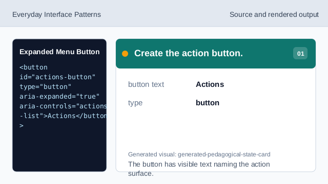
The button has visible text naming the action surface. Mark the shown state.
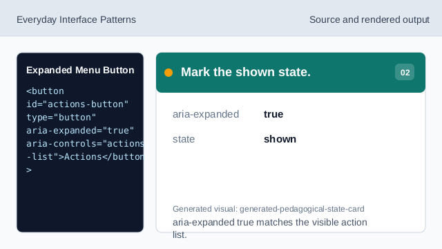
aria-expanded true matches the visible action list. Connect the button to the list.
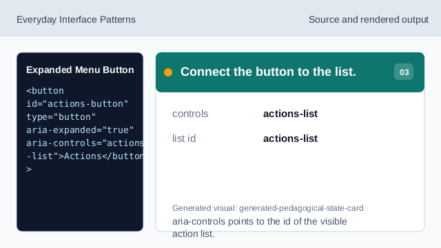
aria-controls points to the id of the visible action list. Show the available actions.
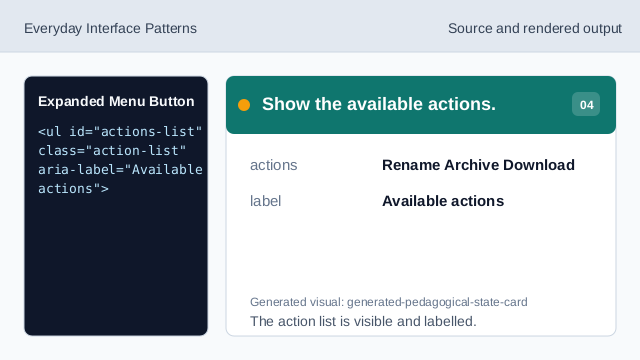
The action list is visible and labelled. State the behavior honestly.
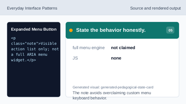
The note avoids overclaiming custom menu keyboard behavior. Check the expanded menu pattern.
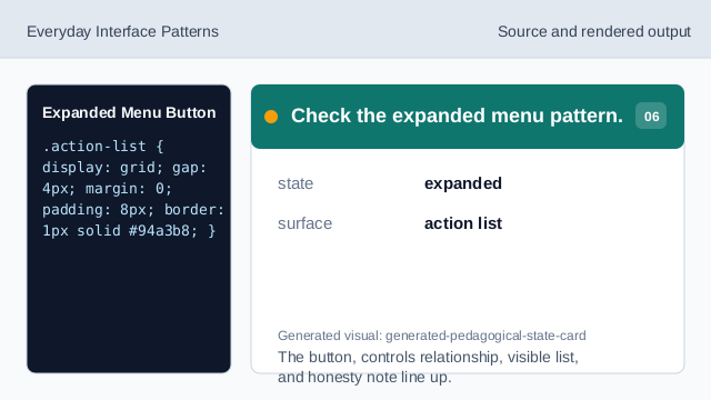
The button, controls relationship, visible list, and honesty note line up.
expanded button
aria-expanded="true" communicates that related content is visible.
controlled list
aria-controls points from the button to the visible action list.
honest action list
A simple visible list should not claim full menu keyboard behavior.