Popup and Menu Patterns
Anchored Popover Panel
A button and small popover help panel show a deterministic static shown state without JavaScript.
Program
A popover can be taught as a visible anchored panel state. This lesson marks the panel as shown for the replay without running a click handler.
popover_panel_anchor.html
Visuals: captured from real browser rendering
<section class="popover-demo">
  <button id="details-button" type="button" popovertarget="details-panel" aria-describedby="popover-note">Show details</button>
  <div id="details-panel" popover class="popover-panel" data-state="shown">
    <h2>Plan details</h2>
    <p>Plan: Starter. Renewal: July 15.</p>
  </div>
  <p id="popover-note">Static shown state for this lesson; no click handler runs.</p>
</section>
<style>
  .popover-demo { display: grid; gap: 8px; max-width: 30rem; }
  .popover-panel[data-state="shown"] { display: block; position: static; border: 1px solid #94a3b8; padding: 10px; }
  #popover-note { margin: 0; color: #475569; }
</style>
Connect the button to the panel.
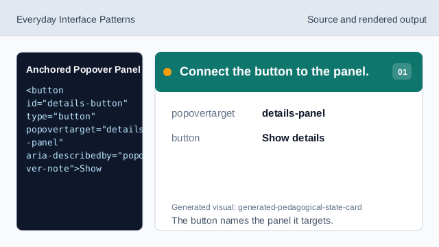
The button names the panel it targets. Create the target panel.
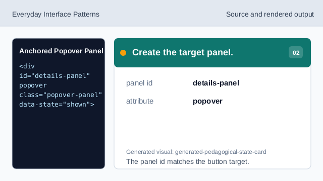
The panel id matches the button target. Mark the replay state honestly.
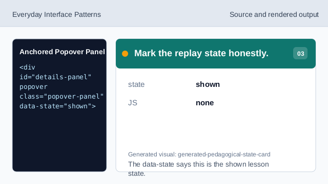
The data-state says this is the shown lesson state. Use pinned panel details.
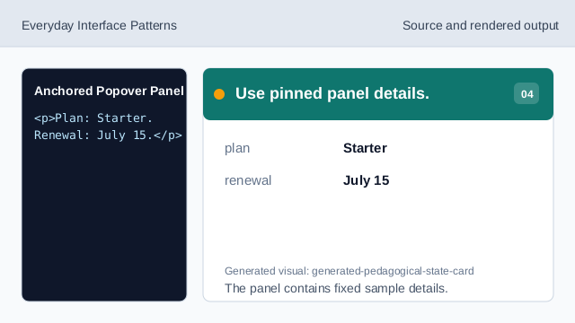
The panel contains fixed sample details. Explain what is not running.
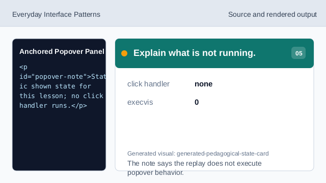
The note says the replay does not execute popover behavior. Check the visible popover state.
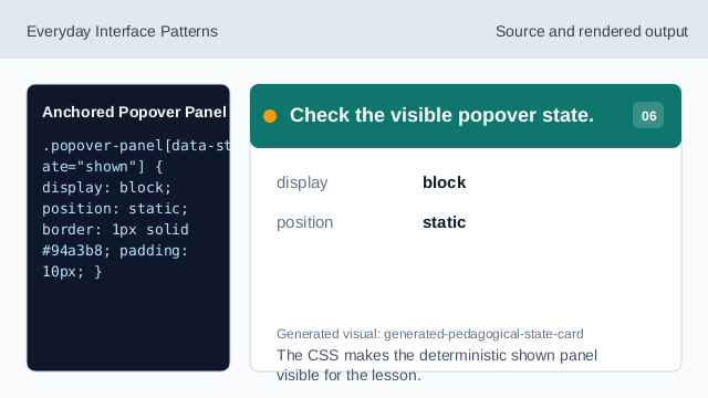
The CSS makes the deterministic shown panel visible for the lesson.
popover target
popovertarget can point from a button to a popover panel id.
static shown state
data-state="shown" records the deterministic lesson state.
anchored help panel
The visible panel appears near the button and explains pinned details.