Preference Settings Patterns
Theme Toggle Status
A pressed theme button updates a preview panel and reports the active theme in a polite status line.
Program
Theme toggles should expose pressed state, update a visible preview, and say which preference is active.
theme_toggle_status.html
Visuals: captured from real browser rendering
<button id="theme-toggle" aria-pressed="false">Dark mode</button>
<section id="theme-preview" data-theme="light">Preview panel</section>
<p id="theme-status" role="status">Light theme active.</p>
<style>
  #theme-preview[data-theme="dark"] { background: #111827; color: white; }
</style>
<script>
  const themeToggle = document.querySelector("#theme-toggle");
  const themePreview = document.querySelector("#theme-preview");
  const themeStatus = document.querySelector("#theme-status");
  themeToggle.addEventListener("click", () => {
    const dark = themeToggle.getAttribute("aria-pressed") !== "true";
    themeToggle.setAttribute("aria-pressed", String(dark));
    themePreview.dataset.theme = dark ? "dark" : "light";
    themeStatus.textContent = dark ? "Dark theme active." : "Light theme active.";
  });
</script>
Start with an unpressed toggle.
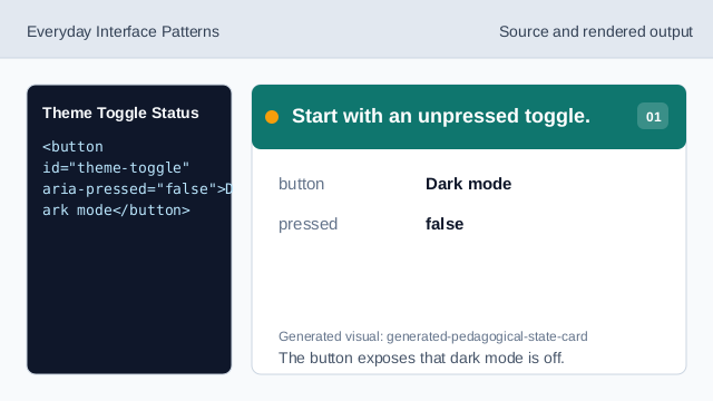
The button exposes that dark mode is off. Show the light preview state.
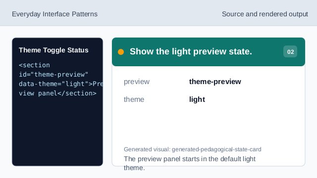
The preview panel starts in the default light theme. Style the dark theme.
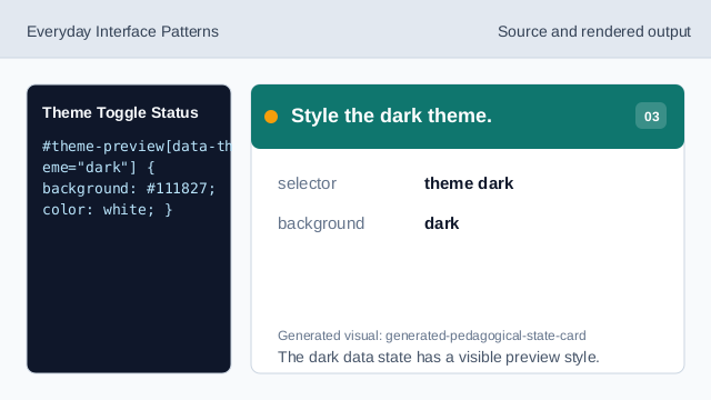
The dark data state has a visible preview style. Listen for the toggle click.
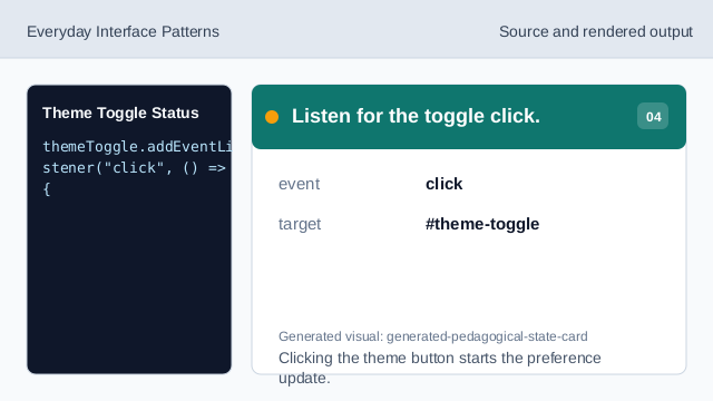
Clicking the theme button starts the preference update. Check the current pressed state.
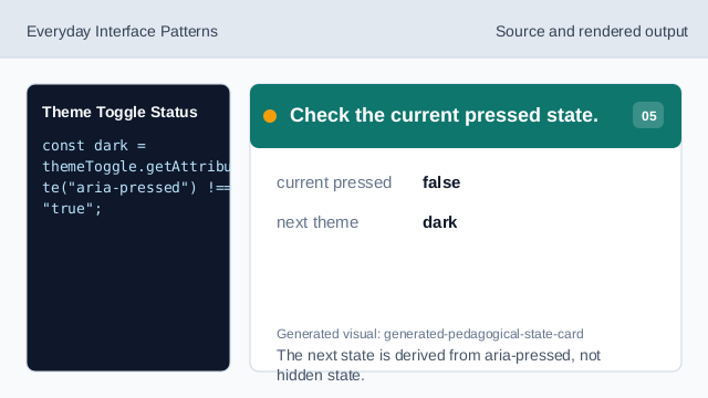
The next state is derived from aria-pressed, not hidden state. Update pressed state and preview.
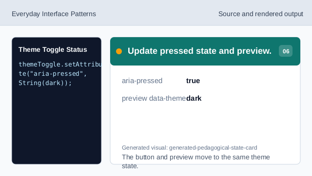
The button and preview move to the same theme state. Render the theme status.
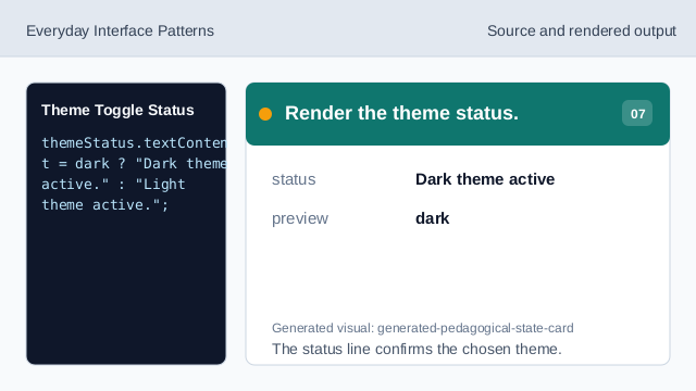
The status line confirms the chosen theme.
aria-pressed
aria-pressed exposes whether a toggle button is currently active.
data theme
A data attribute can hold the selected visual theme.
status text
Status text confirms the resulting preference.