Media and Icon Patterns
Responsive Media Card
A card contains an inline SVG thumbnail inside a fixed aspect-ratio frame that scales with width.
Program
Responsive media cards need a predictable media slot. An aspect-ratio frame keeps the thumbnail shape stable as the card changes width.
responsive_media_card.html
Visuals: captured from real browser rendering
<article class="media-card">
  <div class="thumb-frame">
    <svg viewBox="0 0 120 80" role="img" aria-label="Mountain thumbnail">
      <path d="M10 70 L45 28 L70 58 L88 38 L112 70 Z"></path>
    </svg>
  </div>
  <h2>Trip preview</h2>
</article>
<style>
  .media-card { max-width: 18rem; border: 1px solid #94a3b8; padding: 12px; }
  .thumb-frame { aspect-ratio: 3 / 2; overflow: hidden; }
  .thumb-frame svg { width: 100%; height: 100%; display: block; fill: #0f766e; }
</style>
Create the media card.
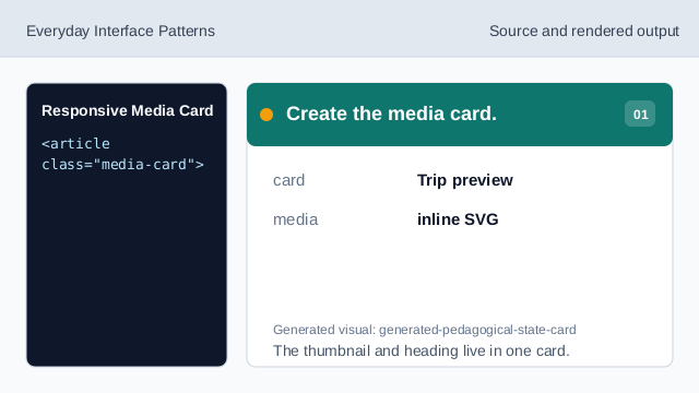
The thumbnail and heading live in one card. Set the media frame ratio.
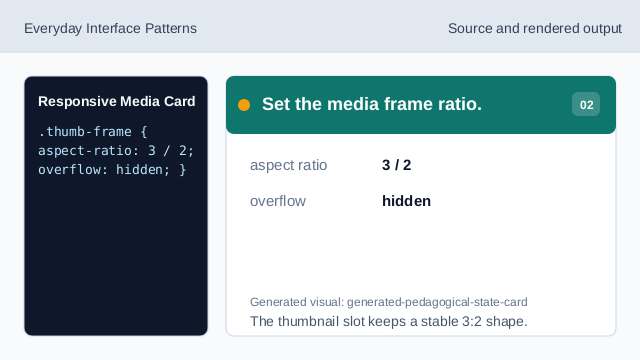
The thumbnail slot keeps a stable 3:2 shape. Name the thumbnail SVG.
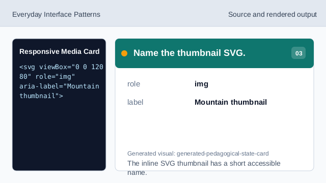
The inline SVG thumbnail has a short accessible name. Scale the SVG to the frame.
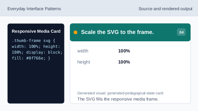
The SVG fills the responsive media frame. Render the responsive card.
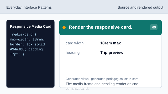
The media frame and heading render as one compact card. Check the media shape.
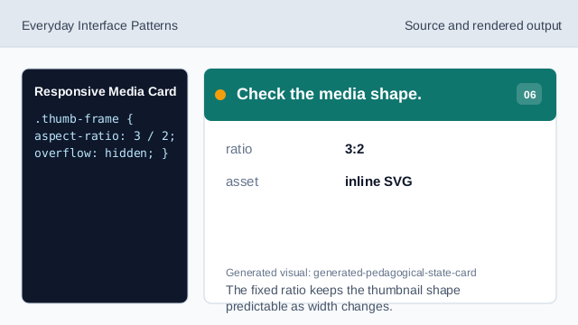
The fixed ratio keeps the thumbnail shape predictable as width changes.
media card
A card can combine a stable media area with nearby text.
aspect ratio
aspect-ratio preserves the media frame shape.
SVG scaling
width and height percentages let inline SVG fill the frame.