Media and Icon Patterns
Decorative Icon Button
A button uses a decorative inline SVG icon with aria-hidden="true" plus visible text, so the accessible name comes from the text.
Program
Icons inside buttons can be decorative when visible text already names the action. Hide the SVG from the accessibility tree and keep the text label visible.
decorative_icon_button.html
Visuals: captured from real browser rendering
<button class="icon-button">
  <svg aria-hidden="true" viewBox="0 0 16 16" focusable="false">
    <path d="M8 1 L10 6 H15 L11 9 L13 15 L8 11 L3 15 L5 9 L1 6 H6 Z"></path>
  </svg>
  <span>Save favorite</span>
</button>
<style>
  .icon-button { display: inline-flex; align-items: center; gap: 8px; padding: 10px 14px; }
  .icon-button svg { width: 16px; height: 16px; fill: #0f766e; }
</style>
Create the icon button.
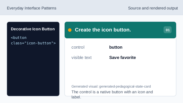
The control is a native button with an icon and label. Hide the decorative icon.
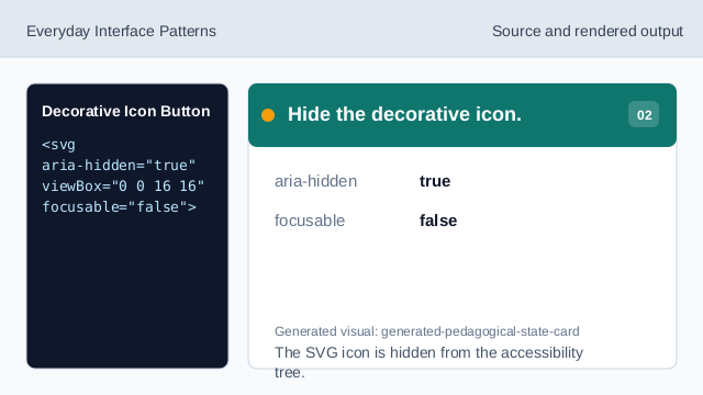
The SVG icon is hidden from the accessibility tree. Keep the visible text label.
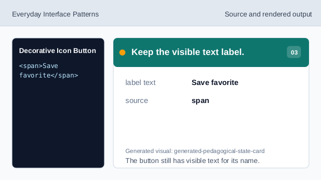
The button still has visible text for its name. Render icon and text together.
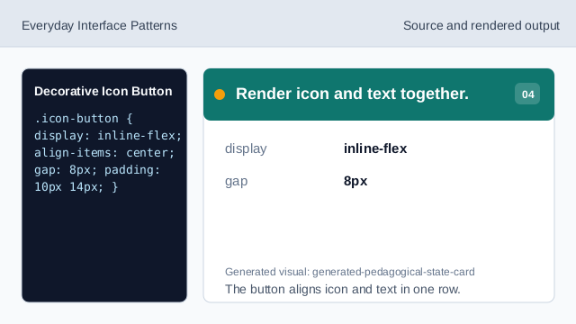
The button aligns icon and text in one row. Size the decorative icon.
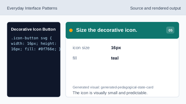
The icon is visually small and predictable. Check the button name.
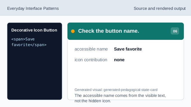
The accessible name comes from the visible text, not the hidden icon.
decorative icon
aria-hidden hides an icon when it does not add a separate meaning.
visible label
Visible text can provide the button accessible name.
icon button layout
inline-flex aligns the icon and text without changing the name.