Form Feedback Patterns
Required Field Hint
A required email field keeps helper text visible, shows one field-level error, and marks the input invalid only after submit.
Program
Required fields work best when the hint is always available and the failure state is shown near the control that needs attention.
required_field_hint.html
Visuals: captured from real browser rendering
<form id="signup" novalidate>
  <label for="email">Email</label>
  <input id="email" type="email" required aria-describedby="email-hint email-error">
  <p id="email-hint">Use a work email address.</p>
  <p id="email-error" hidden>Enter an email address.</p>
  <button>Continue</button>
</form>
<style>
  #email[aria-invalid="true"] { border: 2px solid #dc2626; }
  #email-error { color: #b91c1c; font-weight: 700; }
</style>
<script>
  const form = document.querySelector("#signup");
  const email = document.querySelector("#email");
  const error = document.querySelector("#email-error");
  form.addEventListener("submit", event => {
    event.preventDefault();
    const empty = email.value.trim() === "";
    email.setAttribute("aria-invalid", String(empty));
    error.hidden = !empty;
  });
</script>
Mark the field required.
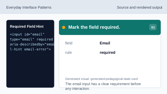
The email input has a clear requirement before any interaction. Connect hint and error text.
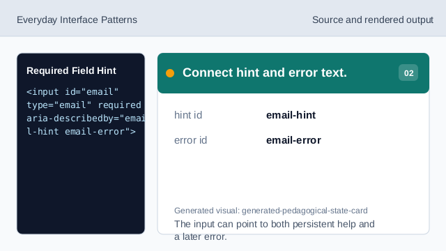
The input can point to both persistent help and a later error. Keep the error quiet at first.
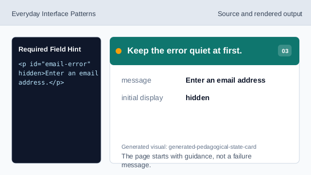
The page starts with guidance, not a failure message. Style the invalid state.
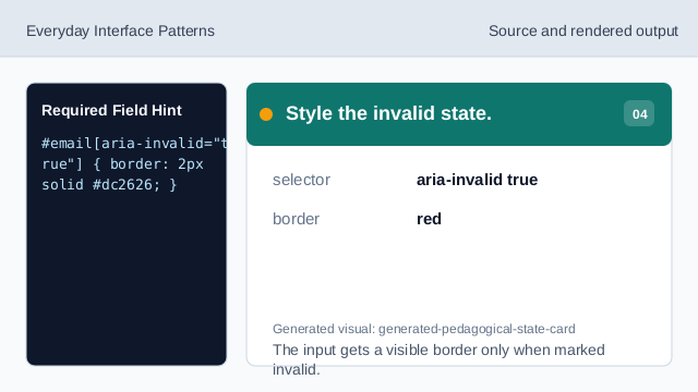
The input gets a visible border only when marked invalid. Listen for submit.
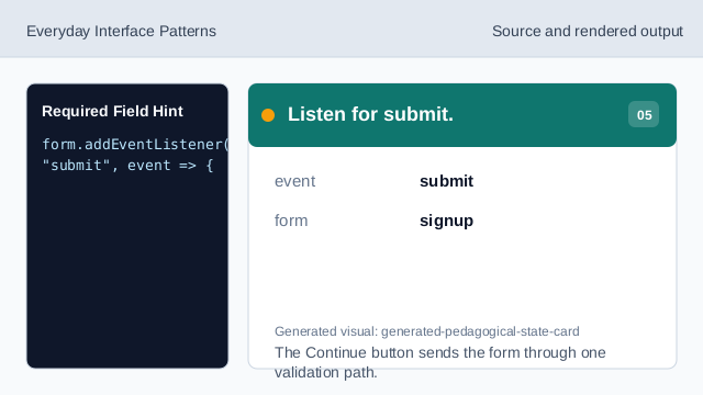
The Continue button sends the form through one validation path. Check for an empty value.
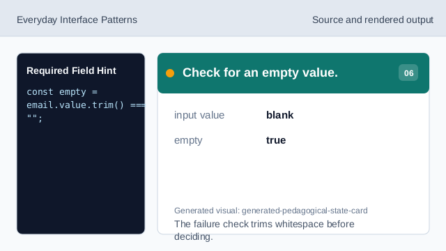
The failure check trims whitespace before deciding. Render the failed field state.
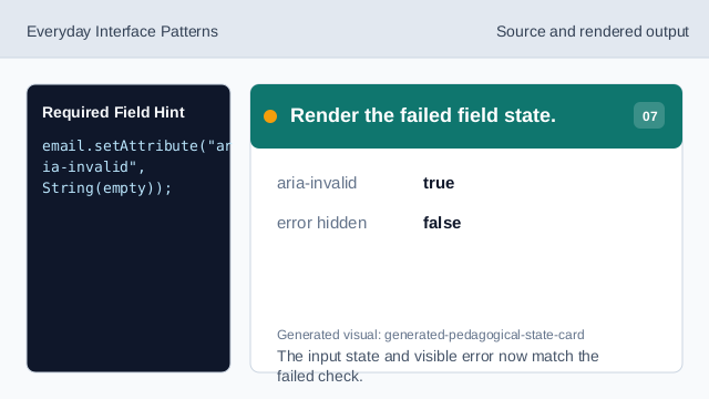
The input state and visible error now match the failed check.
required
required marks a form control that must have a value before submission.
aria-describedby
aria-describedby connects an input to hint and error text.
field error
A field error should appear next to the field that needs correction.