Pointer and Touch Patterns
Pressed Toggle Button
A favorite button toggles aria-pressed and updates nearby status text.
Program
Toggle buttons should expose whether they are pressed and say what changed. This example keeps one boolean state aligned with one status message.
pressed_toggle_button.html
Visuals: captured from real browser rendering
<button id="favorite-toggle" aria-pressed="false">Save favorite</button>
<p id="favorite-status" role="status">Favorite not saved.</p>
<style>
  #favorite-toggle[aria-pressed="true"] { background: #0f766e; color: white; }
</style>
<script>
  const favoriteToggle = document.querySelector("#favorite-toggle");
  const favoriteStatus = document.querySelector("#favorite-status");
  favoriteToggle.addEventListener("click", () => {
    const pressed = favoriteToggle.getAttribute("aria-pressed") === "true";
    const next = !pressed;
    favoriteToggle.setAttribute("aria-pressed", String(next));
    favoriteStatus.textContent = next ? "Favorite saved." : "Favorite not saved.";
  });
</script>
Start with an unpressed toggle.
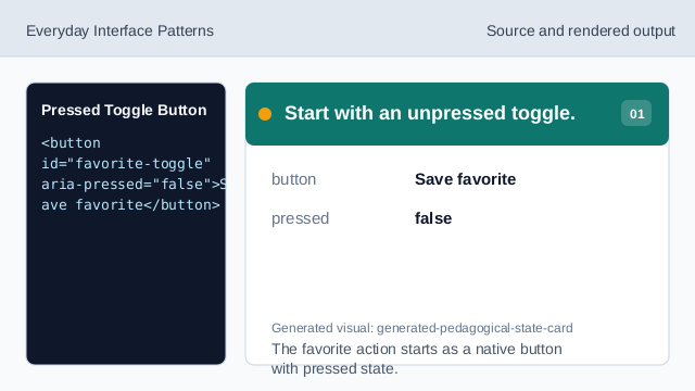
The favorite action starts as a native button with pressed state. Style the pressed state.
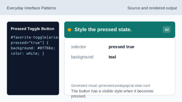
The button has a visible style when it becomes pressed. Listen for the click event.
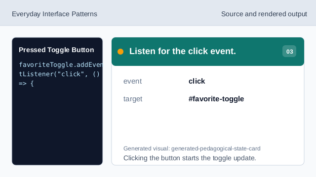
Clicking the button starts the toggle update. Read the current pressed state.
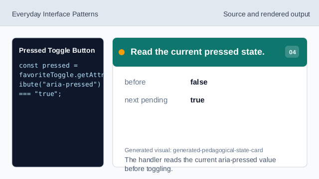
The handler reads the current aria-pressed value before toggling. Update aria-pressed.
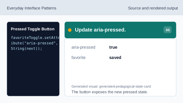
The button exposes the new pressed state. Render the saved status.
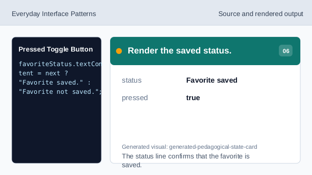
The status line confirms that the favorite is saved. Check both toggle messages.
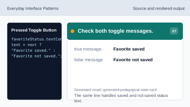
The same line handles saved and not-saved status text.
aria-pressed
aria-pressed exposes the on/off state of a toggle button.
pressed style
The pressed state can have a clear visual style.
status text
A nearby status line confirms the state change in text.