Loading Empty and Error States
Loading Button Status
A load button disables itself, updates a polite status line, and returns to a ready state after a fixed local delay.
Program
Loading states should prevent repeated actions and say what is happening. This pattern uses a button state and a nearby status line.
loading_button_status.html
Visuals: captured from real browser rendering
<button id="load" aria-describedby="load-status">Load orders</button>
<p id="load-status" role="status">Idle.</p>
<style>
  #load[data-state="loading"] { opacity: .65; }
  #load[disabled] { cursor: wait; }
</style>
<script>
  const loadButton = document.querySelector("#load");
  const loadStatus = document.querySelector("#load-status");
  loadButton.addEventListener("click", () => {
    loadButton.disabled = true;
    loadButton.dataset.state = "loading";
    loadStatus.textContent = "Loading orders.";
    setTimeout(() => {
      loadButton.disabled = false;
      loadButton.dataset.state = "ready";
      loadStatus.textContent = "Orders loaded.";
    }, 1000);
  });
</script>
Connect the button to status text.
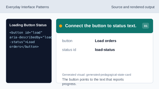
The button points to the text that reports progress. Create a polite status region.
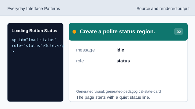
The page starts with a quiet status line. Style the loading state.
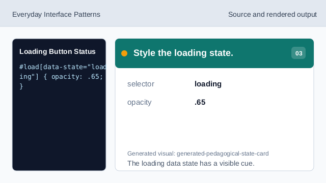
The loading data state has a visible cue. Listen for the load action.
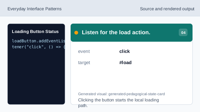
Clicking the button starts the local loading path. Disable during loading.
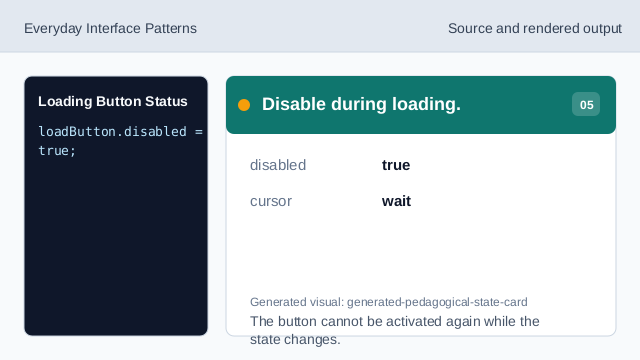
The button cannot be activated again while the state changes. Render the loading message.
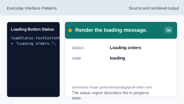
The status region describes the in-progress state. Return to the ready result.
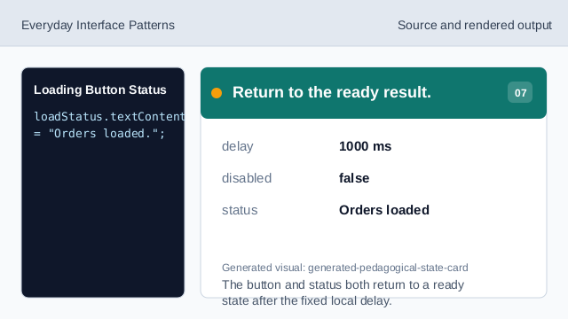
The button and status both return to a ready state after the fixed local delay.
disabled
disabled prevents a button from being activated again while work is pending.
role status
role="status" announces progress text politely.
data state
A data attribute can hold a small visual state hook.