Stateful Controls
Disclosure Panel
A button, hidden panel, and click handler keep a simple details region visible, named, and reversible.
Program
A disclosure starts as static markup, gains a visual affordance, then uses one click to update both visible state and accessible state.
disclosure_panel.html
Visuals: captured from real browser rendering
<button id="shipping-toggle" aria-expanded="false" aria-controls="shipping-panel">Shipping details</button>
<section id="shipping-panel" hidden>
  <p>Orders ship in two business days.</p>
</section>
<style>
  #shipping-toggle[aria-expanded="true"] { background: #0f766e; color: white; }
  #shipping-panel { border: 1px solid #94a3b8; padding: 12px; }
</style>
<script>
  const toggle = document.querySelector("#shipping-toggle");
  const panel = document.querySelector("#shipping-panel");
  toggle.addEventListener("click", () => {
    const open = toggle.getAttribute("aria-expanded") === "true";
    toggle.setAttribute("aria-expanded", String(!open));
    panel.hidden = open;
  });
</script>
Start with a collapsed button.
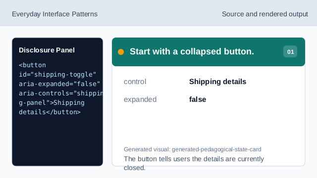
The button tells users the details are currently closed. Keep the panel hidden at first.
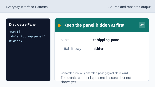
The details content is present in source but not shown yet. Style the open affordance.
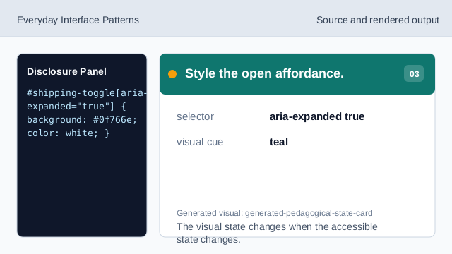
The visual state changes when the accessible state changes. Listen for the user event.
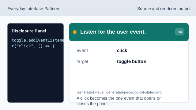
A click becomes the one event that opens or closes the panel. Read the current state.
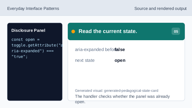
The handler checks whether the panel was already open. Update the button state.
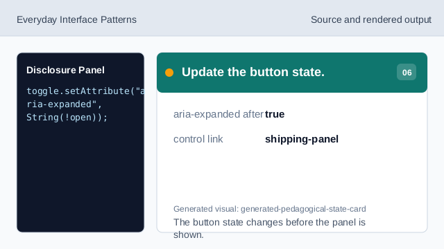
The button state changes before the panel is shown. Show the controlled panel.
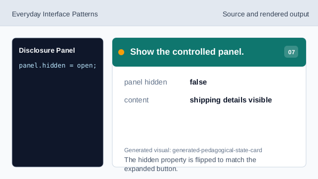
The hidden property is flipped to match the expanded button.
aria-expanded
aria-expanded exposes whether the controlled region is open.
hidden
hidden removes the panel from the rendered page until it is opened.
state sync
The visual panel state and button accessibility state change together.