Choice and Filtering Patterns
Checkbox Reveal Options
A checkbox reveals advanced options, updates a polite status line, and keeps the controlled region hidden until it is requested.
Program
A checkbox can control extra options when the relationship is explicit and the revealed section has a clear name.
checkbox_reveal_options.html
Visuals: captured from real browser rendering
<form id="preferences">
  <label><input id="advanced" type="checkbox" aria-controls="advanced-options"> Show advanced filters</label>
  <fieldset id="advanced-options" hidden>
    <legend>Advanced filters</legend>
    <label><input type="checkbox" name="stock"> In stock only</label>
  </fieldset>
  <p id="advanced-status" role="status">Advanced filters hidden.</p>
</form>
<style>
  #advanced-options:not([hidden]) { border: 1px solid #0f766e; padding: 12px; }
</style>
<script>
  const advanced = document.querySelector("#advanced");
  const options = document.querySelector("#advanced-options");
  const status = document.querySelector("#advanced-status");
  advanced.addEventListener("change", () => {
    const open = advanced.checked;
    options.hidden = !open;
    status.textContent = open ? "Advanced filters shown." : "Advanced filters hidden.";
  });
</script>
Connect the checkbox to its options.
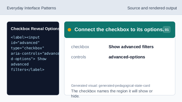
The checkbox names the region it will show or hide. Hide advanced options at first.
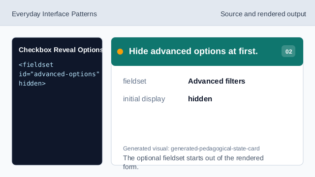
The optional fieldset starts out of the rendered form. Add a polite status line.
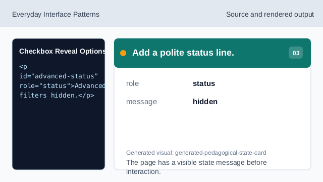
The page has a visible state message before interaction. Style the revealed region.
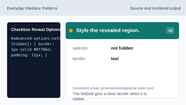
The fieldset gets a clear border when it is visible. Listen for checkbox changes.
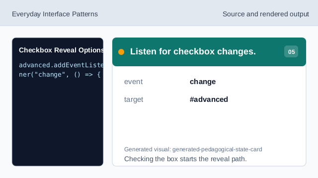
Checking the box starts the reveal path. Read the checked state.
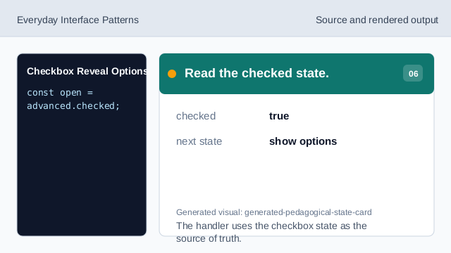
The handler uses the checkbox state as the source of truth. Reveal the options and status.
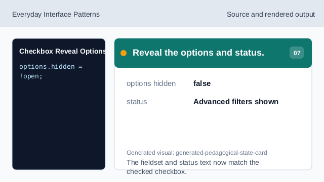
The fieldset and status text now match the checked checkbox.
aria-controls
aria-controls points from a control to the region it changes.
hidden
hidden keeps optional controls out of view until requested.
role status
role="status" announces the visible state change politely.