Backgrounds and Gradients
Radial Gradient Panel
A spotlight panel starts with the default ellipse, switches to a circle, offsets the center, and finally rounds and constrains the panel for a card layout.
Program
radial-gradient paints a ramp that radiates from a point. The shape, center, and stops decide how the rings of color fan out.
radial_gradient_panel.html
Visuals: captured from real browser rendering
<style>
.panel { background-image: radial-gradient(#fde68a, #b45309); color: white; padding: 28px; }
.panel { background-image: radial-gradient(circle, #fde68a, #b45309); }
.panel { background-image: radial-gradient(circle at 30% 30%, #fde68a, #b45309); }
.panel { border-radius: 16px; max-width: 420px; }
</style>

<section class="panel">
  <h2>Spotlight</h2>
  <p>Radial gradients form rings of color</p>
</section>
Paint the default radial ellipse.
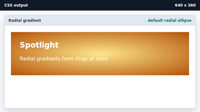
Without a shape keyword the ramp defaults to an ellipse fitting the box. Switch the ramp to a circle.
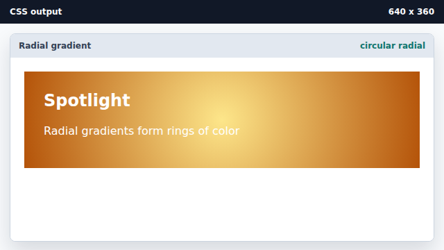
A circle keyword keeps the radius uniform on both axes. Move the bright center off center.
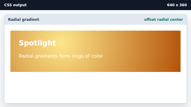
A position descriptor moves the center of the radial ramp. Frame the panel with rounded corners and a width.
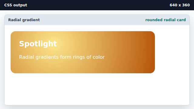
A radius and width constraint turn the panel into a card.
radial-gradient
radial-gradient paints a ramp that radiates from a chosen center.
gradient shape
The circle and ellipse keywords change how the ramp expands.