Typography and Color
Font Stack and Scale
A short release note card gains a serif font stack, a larger base size, a stronger heading, and calmer body color.
Program
Typography starts with a font stack and a scale. The stack chooses acceptable fonts, while size and weight separate headings from body text.
font_stack_scale.html
Visuals: captured from real browser rendering
<style>
.type-card { font-family: Georgia, "Times New Roman", serif; }
.type-card { font-size: 18px; }
.type-card h2 { font-size: 28px; font-weight: 700; }
.type-card p { color: #475569; }
</style>

<article class="type-card">
  <h2>Release Notes</h2>
  <p>Readable typography keeps status updates scannable.</p>
</article>
Choose a serif font stack.
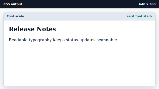
A font stack lists preferred fonts and generic fallbacks. Set a larger base text size.
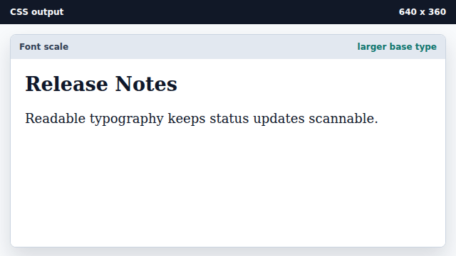
Base font size affects inherited text inside the component. Scale up the heading.
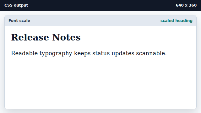
Heading selectors can tune size and weight without extra markup. Use a quieter body text color.
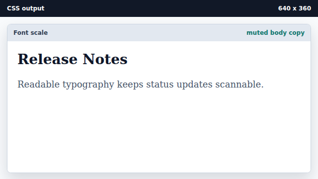
Color helps hierarchy when contrast remains sufficient.
font stack
A font stack lists preferred fonts followed by fallbacks.
type scale
A type scale uses size and weight changes to show hierarchy.