Typography and Color
Color Contrast Tokens
A status panel defines foreground and background tokens, reads them into the component, and adds an accent color with readable contrast.
Program
Color decisions are easier to maintain when reusable tokens hold foreground, background, and accent values. Each token still needs enough contrast in the final UI.
color_contrast_tokens.html
Visuals: captured from real browser rendering
<style>
.contrast { --fg: #0f172a; --bg: #f8fafc; }
.contrast { color: var(--fg); background: var(--bg); }
.contrast { border: 3px solid #0f766e; padding: 18px; }
.contrast strong { color: #0f766e; }
</style>

<section class="contrast">
  <strong>System ready</strong>
  <span>Contrast target met</span>
</section>
Define foreground and background tokens.
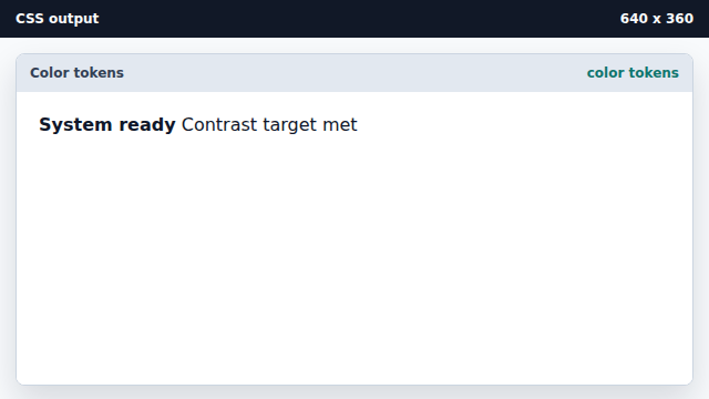
Custom properties can hold color choices for reuse. Apply the contrast pair.
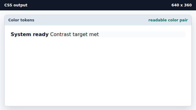
Foreground and background need to be evaluated together. Add an accent border and spacing.
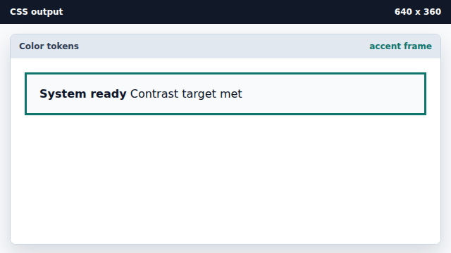
Accent color should reinforce state without carrying meaning alone. Color the important text with the accent.
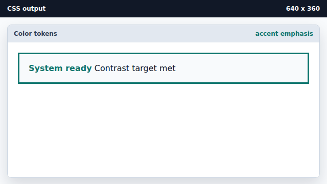
Emphasis can use accent color while body text keeps high contrast.
contrast
Contrast is the visible difference between foreground and background colors.
color token
A color token is a named reusable color value.