Privacy Controls Patterns
Visibility Choice
A static privacy choice panel shows Public and Private radio options, one selected state, helper text, and no storage or backend.
Program
Privacy choices should make the selected state and meaning visible before anything is saved. This lesson uses one pinned choice state.
profile_visibility_choice.html
Visuals: captured from real browser rendering
<section class="visibility-choice" aria-labelledby="visibility-title">
  <h2 id="visibility-title">Profile visibility</h2>
  <fieldset aria-describedby="visibility-help">
    <legend>Who can see your profile?</legend>
    <label><input type="radio" name="visibility" value="public"> Public</label>
    <label><input type="radio" name="visibility" value="private" checked> Private</label>
  </fieldset>
  <p id="visibility-help">Private limits profile details to signed-in contacts.</p>
  <p class="note">Static privacy choice only; no preference storage or account backend runs.</p>
</section>
<style>
  .visibility-choice { display: grid; gap: 10px; max-width: 36rem; border: 1px solid #64748b; padding: 12px; }
  .visibility-choice fieldset { display: grid; gap: 8px; border: 1px solid #cbd5e1; }
  .visibility-choice p, .note { margin: 0; }
  .note { color: #475569; }
</style>
Label the privacy choice panel.
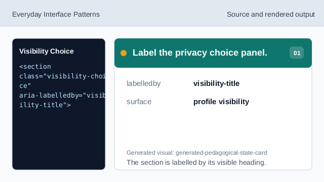
The section is labelled by its visible heading. Group the visibility choices.
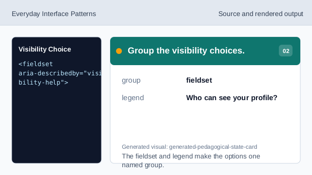
The fieldset and legend make the options one named group. Show the public option.
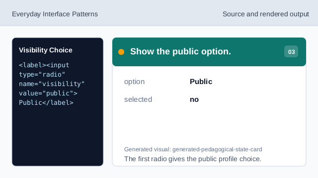
The first radio gives the public profile choice. Mark Private as selected.
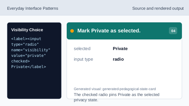
The checked radio pins Private as the selected privacy state. Explain the selected choice.
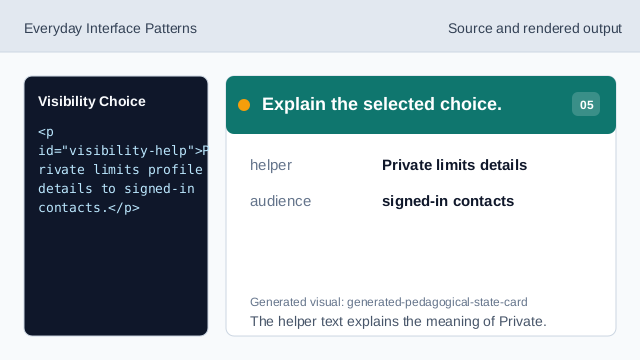
The helper text explains the meaning of Private. Check the profile visibility choice.
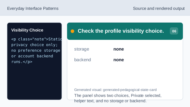
The panel shows two choices, Private selected, helper text, and no storage or backend.
radio group
Public and Private are one exclusive privacy choice group.
selected state
The checked radio marks the pinned selected state.
helper text
The helper text explains what Private means without saving it.