Skeleton Placeholder Patterns
Skeleton Card
A static loading card placeholder shows card title placeholder, two text rows, avatar block, and Skeleton preview status.
Program
Skeleton placeholders reserve visible space before the real content is known.
skeleton_card_placeholder.html
Visuals: captured from real browser rendering
<section class="skeleton-preview" aria-labelledby="skeleton-preview-title"><h2 id="skeleton-preview-title">Skeleton card placeholder</h2><div class="skeleton-card" aria-label="Static skeleton card preview"><span class="avatar">avatar block</span><span>card title placeholder</span><span>text row</span><span>text row</span></div><dl>
  <div><dt>Title</dt><dd>card title placeholder</dd></div>
  <div><dt>Text rows</dt><dd>two text rows</dd></div><div><dt>Avatar</dt><dd>avatar block</dd></div>
  <div><dt>Status</dt><dd><span class="badge">Skeleton preview</span></dd></div></dl>
  <p class="check">Learner check: the placeholder reserves card space before content is known.</p>
  <p class="note">Static skeleton card placeholder only; no fetch, network, API, timer, polling, promise, data loading, content swap, layout measurement, ResizeObserver, animation, shimmer loop, requestAnimationFrame, CSS keyframes, script, event listener, storage, cookie, routing, navigation, object URL, download, service worker, account/session behavior, live loading state, live skeleton swap, or live submission runs.</p></section>
<style>
  .skeleton-preview { display: grid; gap: 10px; max-width: 38rem; border: 1px solid #64748b; padding: 12px; background: #f8fafc; }
  .skeleton-card { display: grid; grid-template-columns: 52px 1fr; gap: 8px; max-width: 280px; border: 1px solid #cbd5e1; background: #ffffff; padding: 10px; }
  .skeleton-card span { border-radius: 6px; background: #e2e8f0; color: #475569; padding: 8px; }
  .skeleton-card .avatar { grid-row: span 3; display: grid; place-items: center; }
  .skeleton-preview dl { display: grid; gap: 8px; margin: 0; }
  .skeleton-preview dl div { display: grid; grid-template-columns: 8rem 1fr; gap: 8px; }
  .skeleton-preview dt { color: #475569; }
  .skeleton-preview dd, .check, .note { margin: 0; }
  .badge { border-radius: 999px; background: #e2e8f0; padding: 2px 8px; }
  .note { color: #475569; }
</style>
Label the skeleton card placeholder.
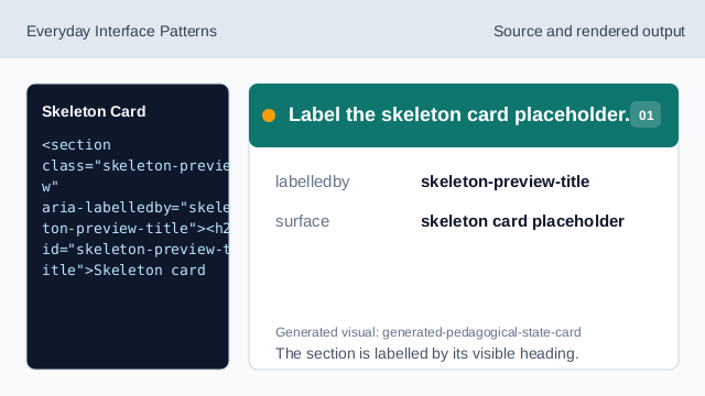
The section is labelled by its visible heading. Show card placeholder structure.
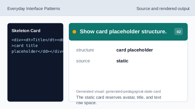
The static card reserves avatar, title, and text row space. Show exact placeholder rows.
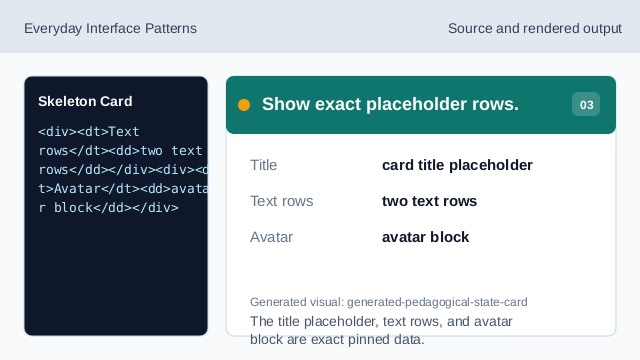
The title placeholder, text rows, and avatar block are exact pinned data. Render skeleton-preview status.
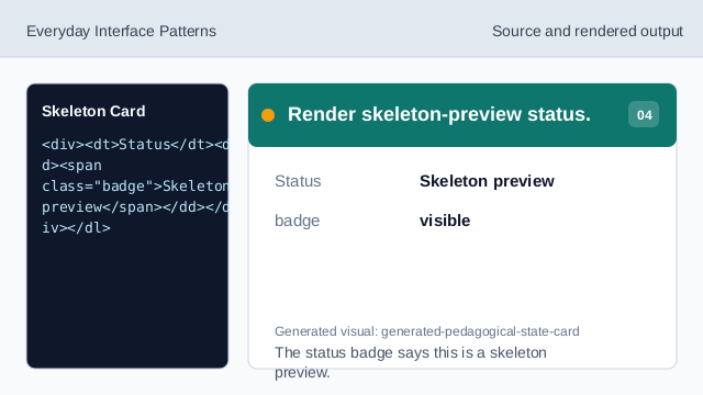
The status badge says this is a skeleton preview. Check skeleton readback.
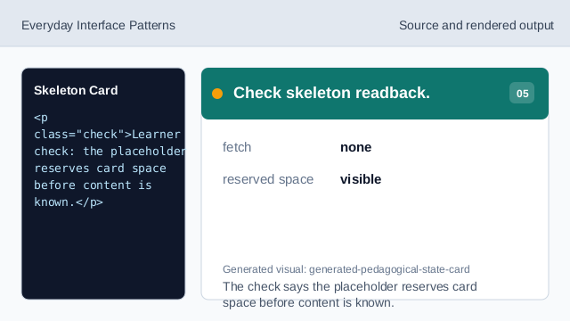
The check says the placeholder reserves card space before content is known. Check skeleton honesty.
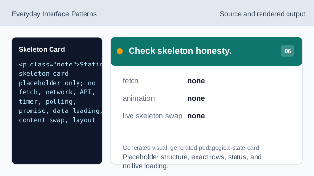
Placeholder structure, exact rows, status, and no live loading.
step flow
step(1) labels the source, step(2) shows the browser structure, step(3) shows exact placeholder rows, step(4) shows skeleton-preview status, step(5) checks placeholder readback, and step(6) checks the honesty note.
placeholder readback
The section heading names the skeleton card placeholder surface.
placeholder rows
Title, Text rows, Avatar, and Status values are exact pinned data.
no live loading
The lesson should not imply fetches, networks, APIs, timers, polling, promises, data loading, content swaps, layout measurement, ResizeObserver, animation, shimmer loops, requestAnimationFrame, CSS keyframes, scripts, event listeners, storage, cookies, routing, navigation, object URLs, downloads, service workers, account/session behavior, live loading states, live skeleton swaps, or live submissions.