Detail Panel Patterns
Panel Close Warning
A static panel close warning shows unsaved Notes field, Needs receipt draft value, Review before closing next step, and Close warning preview status.
Program
A close warning should tell learners what would need review without intercepting a real close event.
panel_close_warning.html
Visuals: captured from real browser rendering
<section class="close-warning" aria-labelledby="close-warning-title"><h2 id="close-warning-title">Panel close warning</h2><div class="warning-card" aria-label="Static close warning preview"><span>Unsaved: Notes</span><span>Needs receipt</span></div><dl>
  <div><dt>Unsaved field</dt><dd>Notes</dd></div>
  <div><dt>Draft value</dt><dd>Needs receipt</dd></div><div><dt>Next step</dt><dd>Review before closing</dd></div>
  <div><dt>Status</dt><dd><span class="badge">Close warning preview</span></dd></div></dl>
  <p class="check">Learner check: the warning explains what needs review before closing.</p>
  <p class="note">Static panel close warning only; no drawer engine, modal, dialog API, focus trap, close interception, route change, list selection engine, resize observer, media query listener, panel animation, row mutation, API, network, storage, cookie, script, event listener, form submit, input, textarea, contenteditable, timer, analytics, object URL, download, service worker, account/session behavior, live detail panel, live drawer, live routing, or live submission runs.</p></section>
<style>
  .close-warning { display: grid; gap: 10px; max-width: 38rem; border: 1px solid #b45309; padding: 12px; background: #fffbeb; }
  .warning-card { display: grid; gap: 6px; justify-self: start; min-width: 220px; border: 1px solid #b45309; background: #ffffff; padding: 10px; }
  .warning-card span:first-child { color: #92400e; font-weight: 700; border-bottom: 1px solid #fde68a; padding-bottom: 4px; }
  .close-warning dl { display: grid; gap: 8px; margin: 0; }
  .close-warning dl div { display: grid; grid-template-columns: 8rem 1fr; gap: 8px; }
  .close-warning dt { color: #475569; }
  .close-warning dd, .check, .note { margin: 0; }
  .badge { border-radius: 999px; background: #fde68a; padding: 2px 8px; }
  .note { color: #475569; }
</style>
Label the panel close warning.
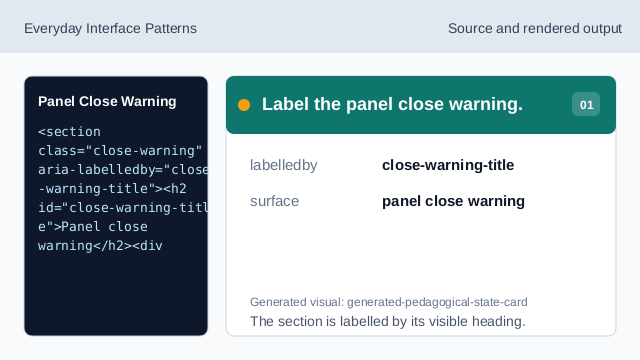
The section is labelled by its visible heading. Show warning structure.
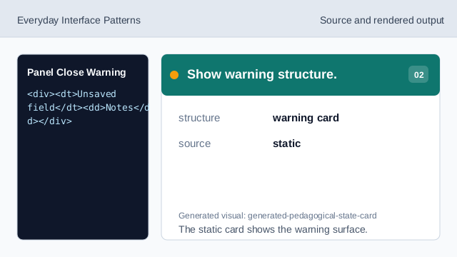
The static card shows the warning surface. Show exact warning rows.
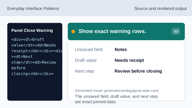
The unsaved field, draft value, and next step are exact pinned data. Render close-warning-preview status.
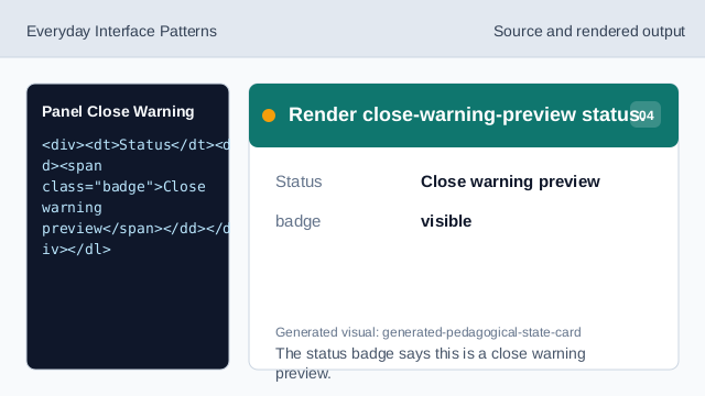
The status badge says this is a close warning preview. Check close warning readback.
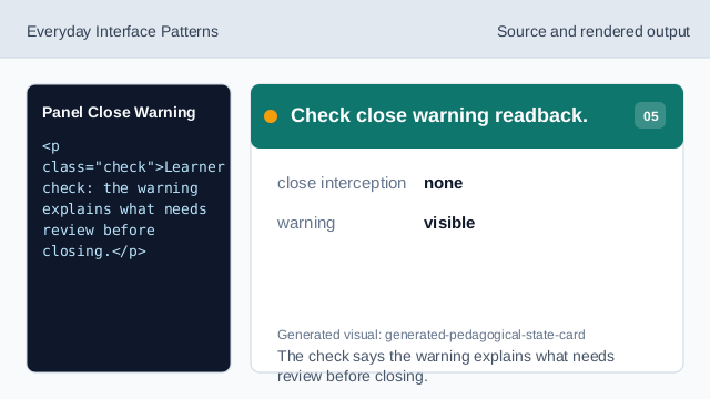
The check says the warning explains what needs review before closing. Check close warning honesty.
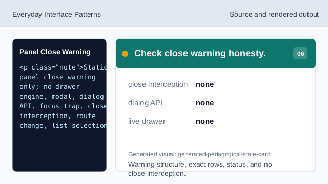
Warning structure, exact rows, status, and no close interception.
step flow
step(1) labels the source, step(2) shows the warning structure, step(3) shows exact warning rows, step(4) shows close-warning-preview status, step(5) checks close-warning readback, and step(6) checks the honesty note.
close warning readback
The section heading names the panel close warning surface.
warning rows
Unsaved field, Draft value, Next step, and Status values are exact pinned data.
no close interception
The lesson should not imply drawer engines, modals, dialog APIs, focus traps, close interception, route changes, list selection engines, resize observers, media query listeners, panel animations, row mutations, APIs, networks, storage, cookies, scripts, event listeners, form submits, inputs, textareas, contenteditable surfaces, timers, analytics, object URLs, downloads, service workers, account/session behavior, live detail panels, live drawers, live routing, or live submissions.