Dismiss and Confirm Patterns
Dismissible Banner
A banner starts visible, offers a clear dismiss button, then hides itself and reports the dismissed state.
Program
Dismissible messages should have a named close control and a small state update that confirms the message is no longer shown.
dismissible_banner.html
Visuals: captured from real browser rendering
<section id="update-banner" role="status" aria-label="Product update">
  <p>New dashboard filters are available.</p>
  <button id="dismiss-banner" aria-label="Dismiss update">Dismiss</button>
</section>
<p id="dismiss-status" role="status">Update banner visible.</p>
<style>
  #update-banner { border: 1px solid #0f766e; padding: 12px; }
  #update-banner[hidden] { display: none; }
</style>
<script>
  const banner = document.querySelector("#update-banner");
  const dismiss = document.querySelector("#dismiss-banner");
  const dismissStatus = document.querySelector("#dismiss-status");
  dismiss.addEventListener("click", () => {
    if (!banner) return;
    banner.hidden = true;
    dismissStatus.textContent = "Update banner dismissed.";
  });
</script>
Create the visible banner.
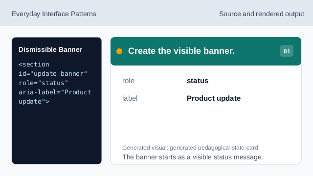
The banner starts as a visible status message. Name the dismiss control.
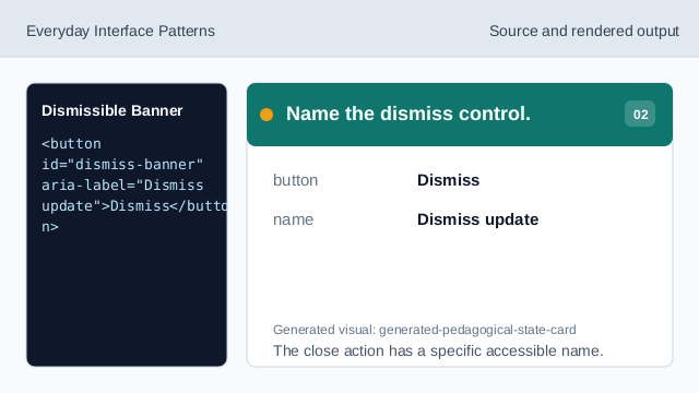
The close action has a specific accessible name. Style the banner affordance.
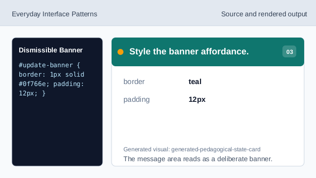
The message area reads as a deliberate banner. Listen for the dismiss click.
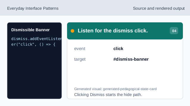
Clicking Dismiss starts the hide path. Check that the banner exists.
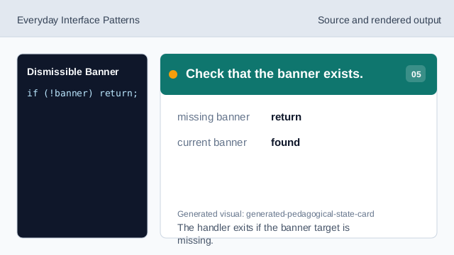
The handler exits if the banner target is missing. Hide the banner.
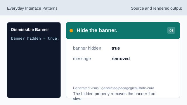
The hidden property removes the banner from view. Render the dismissed status.
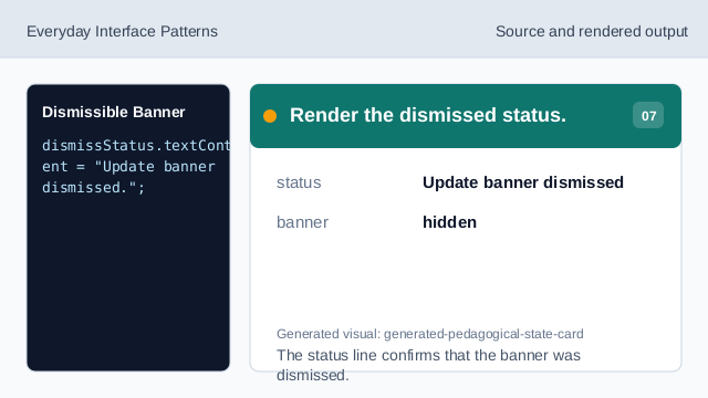
The status line confirms that the banner was dismissed.
dismiss button
A dismiss button lets users remove a nonessential message.
hidden
hidden removes the banner from the rendered page.
role status
role="status" can announce the visible state change politely.